Data Exercise

I chose to complete option 2: generating a synthetic dataset. Note: I will create data with a simple “rectangular structure.”

Loading Packages

library(dplyr)

Attaching package: 'dplyr'
The following objects are masked from 'package:stats':

    filter, lag
The following objects are masked from 'package:base':

    intersect, setdiff, setequal, union
library(purrr)
library(lubridate)

Attaching package: 'lubridate'
The following objects are masked from 'package:base':

    date, intersect, setdiff, union
library(ggplot2)
library(here)
here() starts at /Users/nataliecann/Library/CloudStorage/OneDrive-UniversityofGeorgia/MADA/nataliecann-MADA-portfolio
library(corrplot)
corrplot 0.95 loaded
library(knitr)
library(kableExtra)

Attaching package: 'kableExtra'
The following object is masked from 'package:dplyr':

    group_rows

Setting Seed

I will set a seed so that the synthetic dataset will be reproducible with the code I create in this activity.

# Set seed 
set.seed(116)
# Assign how many patients/observations I want to generate
n_patients <- 100 # I will generate only 100 patients for this exercise since this is the first time I am creating a synthetic dataset and I want to keep things simple!

Generating Data

Now, I will generate my synthetic data set. I will create a data frame with fake data with several measures and risk factors. I will add correlations between some of the variables.

# Create an empty data frame with placeholders for variables
synthetic_data <- data.frame(
  Patient_ID = numeric(n_patients),
  Age = numeric(n_patients),
  Gender = integer(n_patients),
  Enrollment_Date = lubridate::as_date(character(n_patients)),
  Height = numeric(n_patients),
  Weight = numeric(n_patients),
  Blood_Pressure = numeric(n_patients),
  Cholesterol = numeric(n_patients),
  Diabetes = integer(n_patients),
  Smoking = integer(n_patients))

# Variable 1: Patient ID
synthetic_data$Patient_ID <- 1:n_patients

# Variable 2: Age (numeric variable)
synthetic_data$Age <- round(runif(n_patients, min = 18, max = 90), 1)

# Variable 3: Gender (binary variable; 0 = Male, 1 = Female)
synthetic_data$Gender <- as.numeric(sample(c(0, 1), n_patients, replace = TRUE))

# Variable 4: Date of Enrollment (date variable)
synthetic_data$Enrollment_Date <- lubridate::as_date(sample(seq(from = lubridate::as_date("2022-01-01"), to = lubridate::as_date("2022-12-31"), by = "days"), n_patients, replace = TRUE))

# Variable 5: Height (numeric variable; in inches)
synthetic_data$Height <- round(runif(n_patients, min = 57, max = 78), 1)

# Variable 6: Weight (numeric variable; in lbs; dependent on Height) 
synthetic_data$Weight <- ifelse(
  synthetic_data$Height >= 57 & synthetic_data$Height <= 62, 
  round(rnorm(sum(synthetic_data$Height >= 57 & synthetic_data$Height <= 62), mean = 120, sd = 10), 1),ifelse(synthetic_data$Height > 62 & synthetic_data$Height <= 70, round(rnorm(sum(synthetic_data$Height > 62 & synthetic_data$Height <= 70), mean = 160, sd = 15), 1),
    round(rnorm(sum(synthetic_data$Height > 70 & synthetic_data$Height <= 78), mean = 190, sd = 20), 1)))

# Variable 7: Blood Pressure (numeric variable)
synthetic_data$Blood_Pressure <- round(runif(n_patients, min = 90, max = 160), 1)

# Variable 8: Cholesterol Level (numeric variable; in mg/dL; dependent on Weight)
synthetic_data$Cholesterol <- ifelse(synthetic_data$Weight >= 70 & synthetic_data$Weight <= 130, round(rnorm(sum(synthetic_data$Weight >= 70 & synthetic_data$Weight <= 130), mean = 160, sd = 10), 1), ifelse(synthetic_data$Weight >= 131 & synthetic_data$Weight <= 180, round(rnorm(sum(synthetic_data$Weight >= 131 & synthetic_data$Weight <= 180), mean = 185, sd = 10), 1), round(rnorm(sum(synthetic_data$Weight >= 181 & synthetic_data$Weight <= 200), mean = 210, sd = 10), 1)))

# Variable 9: Diabetes (binary variable; 0 = Not Diabetic, 1 = Diabetic)
synthetic_data$Diabetes <- as.numeric(sample(c(0, 1), n_patients, replace = TRUE))

# Variable 10: Smoking (binary variable; 0 = Does Not Smoke, 1 = Smokes)
synthetic_data$Smoking <- as.numeric(sample(c(0, 1), n_patients, replace = TRUE))

# Print the first few rows of the generated data
head(synthetic_data)
  Patient_ID  Age Gender Enrollment_Date Height Weight Blood_Pressure
1          1 71.3      0      2022-11-12   68.6  170.6           96.0
2          2 42.2      0      2022-12-16   69.0  168.9          125.8
3          3 31.9      1      2022-11-20   65.2  171.2          156.6
4          4 38.2      0      2022-10-05   78.0  155.7          109.0
5          5 89.8      1      2022-03-31   77.1  183.8          100.8
6          6 56.5      0      2022-06-23   62.1  174.1           95.2
  Cholesterol Diabetes Smoking
1       177.0        1       0
2       184.7        1       0
3       192.5        1       0
4       194.5        0       0
5       205.4        0       0
6       182.9        0       0

Luckily from the head() output, I can see that this worked!

Exploring Data Structure

Now, I will explore the synthetic dataset I just created. I will do this with the summary(), str(), and glimpse.

summary(synthetic_data)
   Patient_ID          Age            Gender    Enrollment_Date     
 Min.   :  1.00   Min.   :18.20   Min.   :0.0   Min.   :2022-01-06  
 1st Qu.: 25.75   1st Qu.:33.95   1st Qu.:0.0   1st Qu.:2022-04-18  
 Median : 50.50   Median :57.00   Median :0.5   Median :2022-07-18  
 Mean   : 50.50   Mean   :55.38   Mean   :0.5   Mean   :2022-07-18  
 3rd Qu.: 75.25   3rd Qu.:71.38   3rd Qu.:1.0   3rd Qu.:2022-10-25  
 Max.   :100.00   Max.   :89.90   Max.   :1.0   Max.   :2022-12-27  
     Height          Weight      Blood_Pressure   Cholesterol       Diabetes  
 Min.   :57.20   Min.   : 93.7   Min.   : 90.1   Min.   :129.3   Min.   :0.0  
 1st Qu.:62.02   1st Qu.:132.0   1st Qu.:107.2   1st Qu.:170.2   1st Qu.:0.0  
 Median :68.00   Median :160.9   Median :120.0   Median :182.4   Median :0.5  
 Mean   :67.55   Mean   :159.1   Mean   :123.4   Mean   :183.3   Mean   :0.5  
 3rd Qu.:72.97   3rd Qu.:179.2   3rd Qu.:139.9   3rd Qu.:195.1   3rd Qu.:1.0  
 Max.   :78.00   Max.   :228.6   Max.   :158.9   Max.   :217.9   Max.   :1.0  
    Smoking    
 Min.   :0.00  
 1st Qu.:0.00  
 Median :0.00  
 Mean   :0.48  
 3rd Qu.:1.00  
 Max.   :1.00  
str(synthetic_data)
'data.frame':   100 obs. of  10 variables:
 $ Patient_ID     : int  1 2 3 4 5 6 7 8 9 10 ...
 $ Age            : num  71.3 42.2 31.9 38.2 89.8 56.5 87 18.2 48.1 67.3 ...
 $ Gender         : num  0 0 1 0 1 0 0 1 1 1 ...
 $ Enrollment_Date: Date, format: "2022-11-12" "2022-12-16" ...
 $ Height         : num  68.6 69 65.2 78 77.1 62.1 62.1 71.5 69.5 68.4 ...
 $ Weight         : num  171 169 171 156 184 ...
 $ Blood_Pressure : num  96 126 157 109 101 ...
 $ Cholesterol    : num  177 185 192 194 205 ...
 $ Diabetes       : num  1 1 1 0 0 0 0 0 1 1 ...
 $ Smoking        : num  0 0 0 0 0 0 0 0 1 0 ...
glimpse(synthetic_data)
Rows: 100
Columns: 10
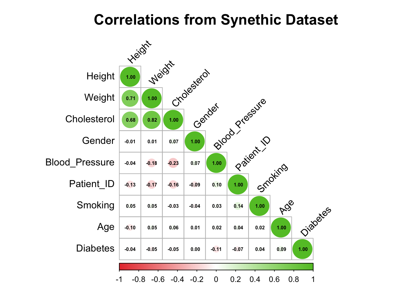
$ Patient_ID      <int> 1, 2, 3, 4, 5, 6, 7, 8, 9, 10, 11, 12, 13, 14, 15, 16,…
$ Age             <dbl> 71.3, 42.2, 31.9, 38.2, 89.8, 56.5, 87.0, 18.2, 48.1, …
$ Gender          <dbl> 0, 0, 1, 0, 1, 0, 0, 1, 1, 1, 0, 1, 0, 0, 1, 1, 0, 1, …
$ Enrollment_Date <date> 2022-11-12, 2022-12-16, 2022-11-20, 2022-10-05, 2022-…
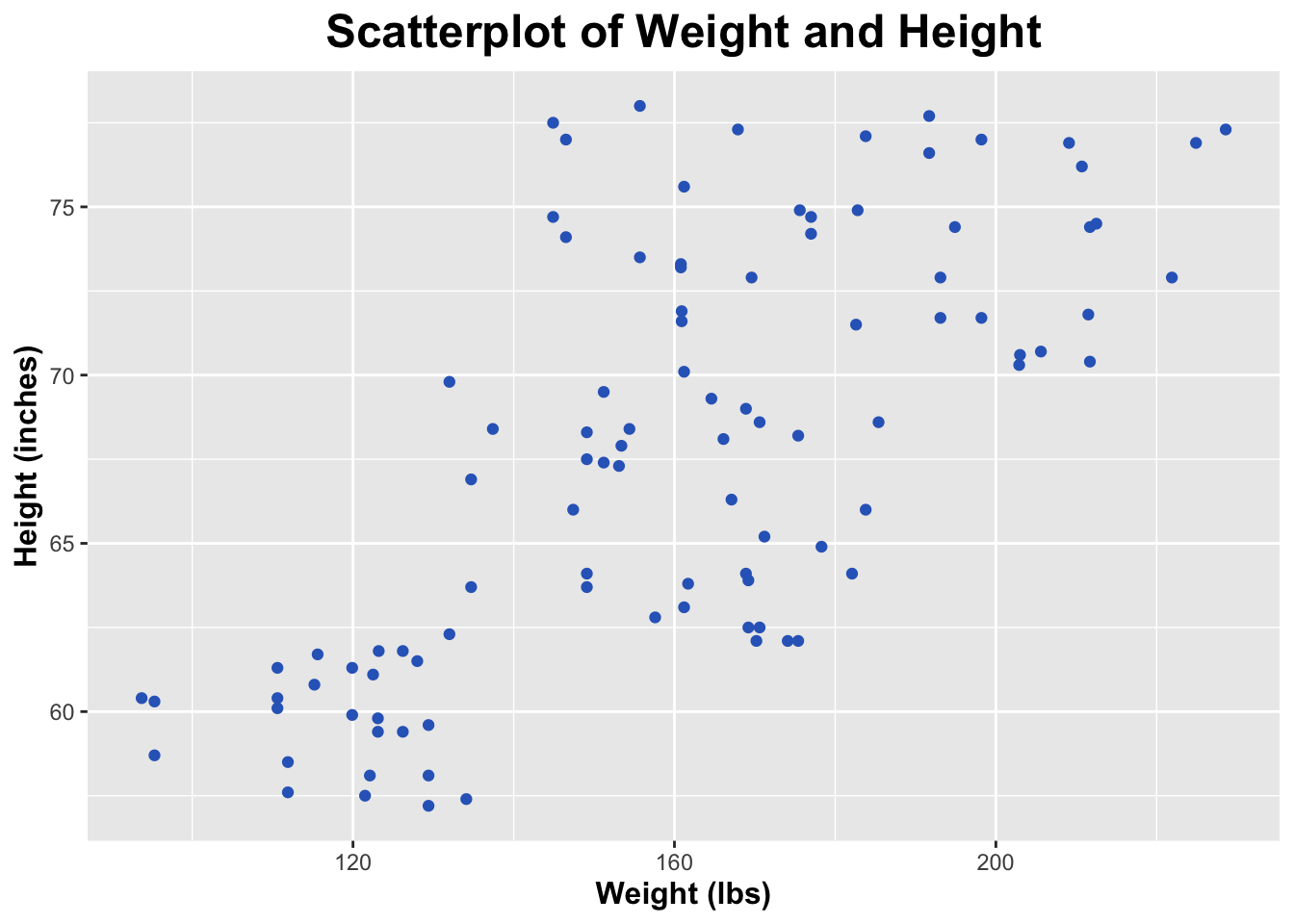
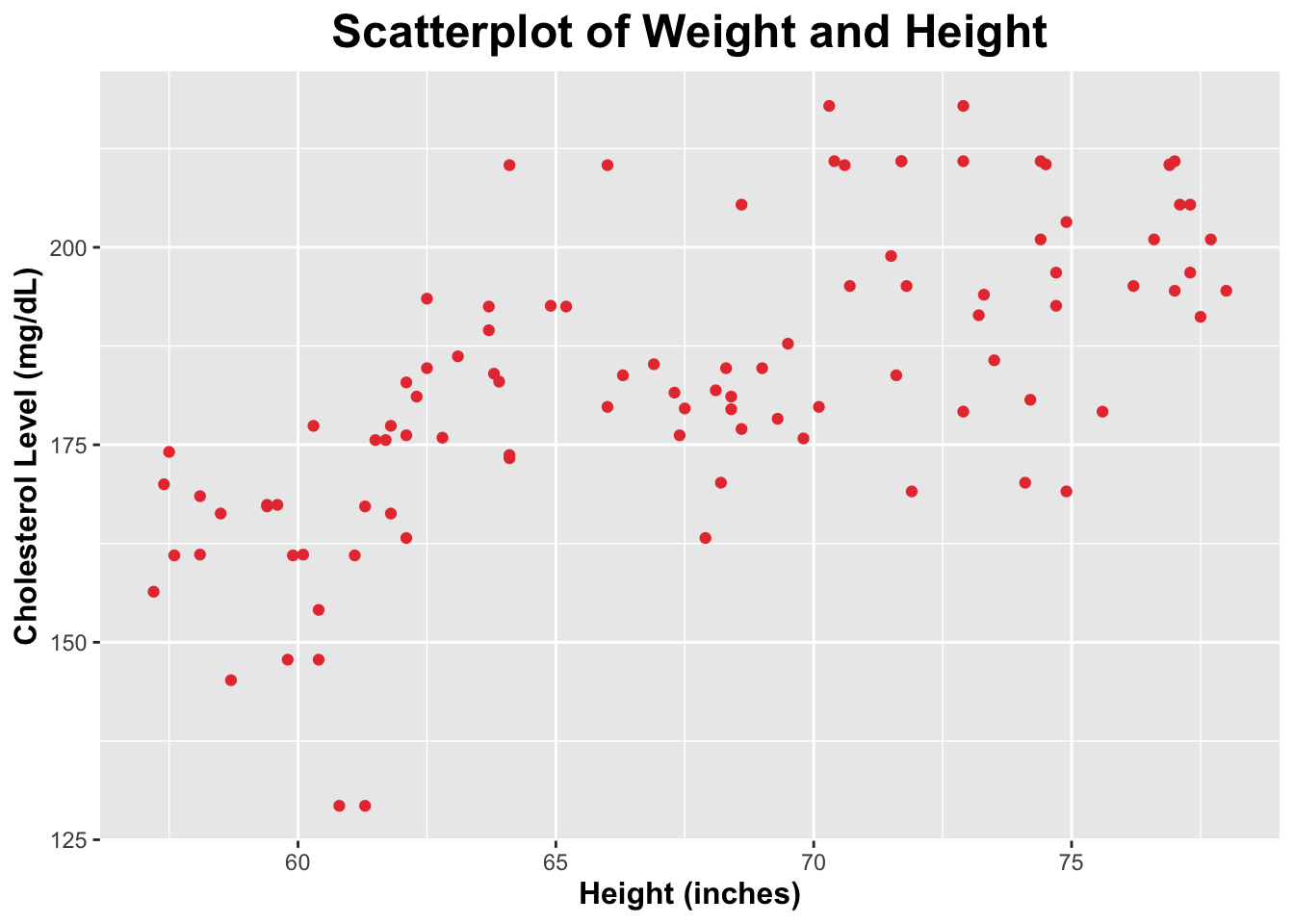
$ Height          <dbl> 68.6, 69.0, 65.2, 78.0, 77.1, 62.1, 62.1, 71.5, 69.5, …
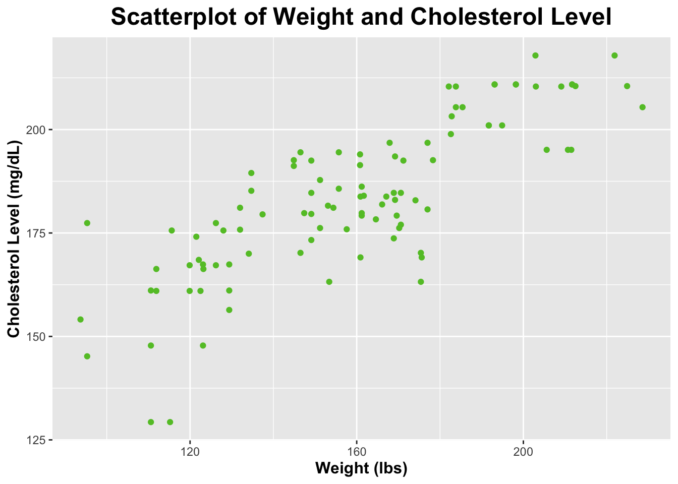
$ Weight          <dbl> 170.6, 168.9, 171.2, 155.7, 183.8, 174.1, 175.4, 182.6…
$ Blood_Pressure  <dbl> 96.0, 125.8, 156.6, 109.0, 100.8, 95.2, 155.1, 99.9, 1…
$ Cholesterol     <dbl> 177.0, 184.7, 192.5, 194.5, 205.4, 182.9, 163.2, 198.9…
$ Diabetes        <dbl> 1, 1, 1, 0, 0, 0, 0, 0, 1, 1, 1, 1, 0, 0, 1, 0, 0, 1, …
$ Smoking         <dbl> 0, 0, 0, 0, 0, 0, 0, 0, 1, 0, 1, 1, 1, 0, 1, 1, 1, 0, …

The summary output shows the minimum, 1st quartile, median, mean, 3rd quartile, and maximum values for each variable. This data is more useful for the continuous variables, such as Height, Weight, and Cholesterol. The str output shows the class of each variable. The glimpse output shows the first few values of each variable.

Plots, Tables, Correlations

Scatterplot and Correlation of Height and Weight

Since I created the weight variable to be depenent on height, I will create a scatterplot to examine the reationship between these two.

ggplot(synthetic_data, aes(x = Weight, y = Height)) +
  geom_point(color = "#3067c2") +
  labs(title = "Scatterplot of Weight and Height",
       x = "Weight (lbs)",
       y = "Height (inches)") + 
  theme(legend.position = "none", plot.title = element_text(size = 18, face = "bold", hjust = 0.5), axis.title.x = element_text(size = 12, face = "bold"), axis.title.y = element_text(size = 12, face = "bold"))

The scaterplot above depicts a positive relationship between weight and height. This means that we see an increase in weight as height increases.

Now, I will create code to assess the strength of the correlation between weight and height using the cor() function.

cor(synthetic_data$Weight, synthetic_data$Height)
[1] 0.709389

The correlation between weight and height is 0.750217, which is pretty high. This indicates that there is a relatively strong relationship between weight and height.

Scatterplot and Correlation of Weight and Cholesterol Level

Since I created the cholesterol variable to be depenent on weight, I will create a scatterplot to examine the reationship between these two.

ggplot(synthetic_data, aes(x = Weight, y = Cholesterol)) +
  geom_point(color = "#63c230") +
  labs(title = "Scatterplot of Weight and Cholesterol Level",
       x = "Weight (lbs)",
       y = "Cholesterol Level (mg/dL)") + 
  theme(legend.position = "none", plot.title = element_text(size = 18, face = "bold", hjust = 0.5), axis.title.x = element_text(size = 12, face = "bold"), axis.title.y = element_text(size = 12, face = "bold"))

The scaterplot above reveals that there is a positive relationship between weight and cholesterol level. This means that as weight increases, cholesterol level also increases.

Now, I will create code to assess the strength of the correlation between weight and cholesterol level by using the cor() function.

cor(synthetic_data$Weight, synthetic_data$Cholesterol)
[1] 0.8155417

The correlation between weight and cholesterol level is 0.7709426, which is pretty high. This indicates that there is a relatively strong relationship between weight and cholesterol level.

Scatterplot and Correlation of Height and Cholesterol Level

Since I created a relationship between weight and cholesterol as well as a relationship between height and weight, I am checking to see if height and cholesterol level have a relationship as a result. I will do this by creating a scatterplot.

ggplot(synthetic_data, aes(x = Height, y = Cholesterol)) +
  geom_point(color = "#e83d3d") +
  labs(title = "Scatterplot of Weight and Height",
       x = "Height (inches)",
       y = "Cholesterol Level (mg/dL)") + 
  theme(legend.position = "none", plot.title = element_text(size = 18, face = "bold", hjust = 0.5), axis.title.x = element_text(size = 12, face = "bold"), axis.title.y = element_text(size = 12, face = "bold"))

From the scatterplot above, it appears as though there is a relationship between cholesterol level and height due to the relationship I created between weight and cholesterol level. The points of the scatterplot appear to be a bit more spaced out than those of the previous scatterplots.

Next, I will assess the strength of the correlation between height and cholesterol level by using the cor() function.

cor(synthetic_data$Height, synthetic_data$Cholesterol)
[1] 0.6777356

The correlation between height and cholesterol level is 0.5984226, which is moderate. This indicates there is a moderate relationship between height and cholesterol level. However, this relationship is not as strong as the relationship between weight and cholesterol level.

Correlation Matrix of All Variables

I will create a correlation matrix to display the correlations between all of the variables within this synthetic dataset.

# I will select only numeric variables (date wouldn't make sense to include here)
cor_matrix <- cor(synthetic_data %>% select(where(is.numeric)))

# Print out so we can see the correlation matrix!
print(cor_matrix)
                Patient_ID          Age       Gender      Height       Weight
Patient_ID      1.00000000  0.041808056 -0.090071146 -0.12744041 -0.171766405
Age             0.04180806  1.000000000  0.009395789 -0.09858675  0.050323944
Gender         -0.09007115  0.009395789  1.000000000 -0.01433314  0.005319659
Height         -0.12744041 -0.098586750 -0.014333136  1.00000000  0.709388957
Weight         -0.17176640  0.050323944  0.005319659  0.70938896  1.000000000
Blood_Pressure  0.09974092  0.021928615  0.067946307 -0.03859859 -0.176520089
Cholesterol    -0.16167647  0.057061265  0.069728916  0.67773561  0.815541663
Diabetes       -0.06997835  0.087519153  0.000000000 -0.03816801 -0.051150566
Smoking         0.13590834  0.021204714 -0.040032038  0.05432258  0.051626270
               Blood_Pressure Cholesterol    Diabetes     Smoking
Patient_ID         0.09974092 -0.16167647 -0.06997835  0.13590834
Age                0.02192862  0.05706127  0.08751915  0.02120471
Gender             0.06794631  0.06972892  0.00000000 -0.04003204
Height            -0.03859859  0.67773561 -0.03816801  0.05432258
Weight            -0.17652009  0.81554166 -0.05115057  0.05162627
Blood_Pressure     1.00000000 -0.23075388 -0.10877200  0.03482333
Cholesterol       -0.23075388  1.00000000 -0.04657569 -0.03045310
Diabetes          -0.10877200 -0.04657569  1.00000000  0.04003204
Smoking            0.03482333 -0.03045310  0.04003204  1.00000000

I will now put this correlation matrix into a table and use the KableExtra package.

kable(cor_matrix, caption = "Correlation Matrix of Numeric Variables") %>%
  kable_styling("striped", full_width = F) %>%
  row_spec(0, background = "#00509e", color = "white") %>%  # Blue header with white text
  row_spec(1:nrow(cor_matrix), background = "#d6eaf8")  # Light blue for rows
Correlation Matrix of Numeric Variables
Patient_ID Age Gender Height Weight Blood_Pressure Cholesterol Diabetes Smoking
Patient_ID 1.0000000 0.0418081 -0.0900711 -0.1274404 -0.1717664 0.0997409 -0.1616765 -0.0699784 0.1359083
Age 0.0418081 1.0000000 0.0093958 -0.0985867 0.0503239 0.0219286 0.0570613 0.0875192 0.0212047
Gender -0.0900711 0.0093958 1.0000000 -0.0143331 0.0053197 0.0679463 0.0697289 0.0000000 -0.0400320
Height -0.1274404 -0.0985867 -0.0143331 1.0000000 0.7093890 -0.0385986 0.6777356 -0.0381680 0.0543226
Weight -0.1717664 0.0503239 0.0053197 0.7093890 1.0000000 -0.1765201 0.8155417 -0.0511506 0.0516263
Blood_Pressure 0.0997409 0.0219286 0.0679463 -0.0385986 -0.1765201 1.0000000 -0.2307539 -0.1087720 0.0348233
Cholesterol -0.1616765 0.0570613 0.0697289 0.6777356 0.8155417 -0.2307539 1.0000000 -0.0465757 -0.0304531
Diabetes -0.0699784 0.0875192 0.0000000 -0.0381680 -0.0511506 -0.1087720 -0.0465757 1.0000000 0.0400320
Smoking 0.1359083 0.0212047 -0.0400320 0.0543226 0.0516263 0.0348233 -0.0304531 0.0400320 1.0000000

I will now create a graphical version of the correlation matrix that aids with visualization of the relationships between variables of this synthetic dataset. I will do this using the corrplot() function.

# Define custom colors
corrplot_colors <- colorRampPalette(c("#e83d3d", "white", "#63c230"))(200)

# Create the correlation plot with variable names on both sides
corrplot(cor_matrix, 
         method = "circle",       # Circle method
         type = "lower",          # Lower half of the correlation matrix (since including the upper half would be repetitive)
         order = "hclust",        # Order variables by hierarchical clustering
         col = corrplot_colors,   # Custom color palette above!
         tl.col = "black",        # Variable names in black
         addCoef.col = "black",   # Correlation coefficients in black
         number.cex = 0.5,        # Adjust coefficient size 
         number.digits = 2,       # Display two decimal places for coefficients
         tl.srt = 45,             # Rotate labels on x-axis
         mar = c(0, 0, 1, 0))     # Margins to adjust spacing
title("Correlations from Synethic Dataset", line = 2, cex.main = 1.5) # Adding a title!

The correlation matrix and plot above show the relationships between all of the variables in the synthetic dataset. The correlation matrix shows the correlation coefficients between each pair of variables. The correlation plot shows the same information in a visual format.

Simple Linear Models

I will now use the lm() function to fit a linear model with cholesterol as the outcome and weight as the predictor. Then, I will apply the summary() function.

Cholesterol_Weight <- lm(Cholesterol ~ Weight, data = synthetic_data)
summary(Cholesterol_Weight)

Call:
lm(formula = Cholesterol ~ Weight, data = synthetic_data)

Residuals:
    Min      1Q  Median      3Q     Max 
-33.070  -5.595   1.213   7.534  24.518 

Coefficients:
             Estimate Std. Error t value Pr(>|t|)    
(Intercept) 107.44682    5.54422   19.38   <2e-16 ***
Weight        0.47676    0.03417   13.95   <2e-16 ***
---
Signif. codes:  0 '***' 0.001 '**' 0.01 '*' 0.05 '.' 0.1 ' ' 1

Residual standard error: 10.86 on 98 degrees of freedom
Multiple R-squared:  0.6651,    Adjusted R-squared:  0.6617 
F-statistic: 194.6 on 1 and 98 DF,  p-value: < 2.2e-16

The intercept (a) is 100.39517; this means that the average cholesterol level (in mg/dL) is 100.39517 when weight is 0 lbs. The slope (b) is 0.55317; this means that for every 1 unit increase in weight (in lbs), cholesterol level (in mg/dL) increases by 0.55317 mg/dL. The p-value is < 2.2e-16.

I will now use the lm() function to fit a linear model with cholesterol as the outcome and height as the predictor. Then, I will apply the summary() function.

Cholesterol_Height <- lm(Cholesterol ~ Height, data = synthetic_data)
summary(Cholesterol_Height)

Call:
lm(formula = Cholesterol ~ Height, data = synthetic_data)

Residuals:
    Min      1Q  Median      3Q     Max 
-41.326  -7.246  -0.234   8.266  34.098 

Coefficients:
            Estimate Std. Error t value Pr(>|t|)    
(Intercept)  46.3665    15.0703   3.077  0.00271 ** 
Height        2.0271     0.2222   9.124 9.62e-15 ***
---
Signif. codes:  0 '***' 0.001 '**' 0.01 '*' 0.05 '.' 0.1 ' ' 1

Residual standard error: 13.79 on 98 degrees of freedom
Multiple R-squared:  0.4593,    Adjusted R-squared:  0.4538 
F-statistic: 83.26 on 1 and 98 DF,  p-value: 9.617e-15

The intercept (a) is 40.8193; this means that the average cholesterol level (in mg/dL) is 40.8193 when height is 0 inches. The slope (b) is 2.1923; this means that for every 1 unit increase in height (in inches), cholesterol level (in mg/dL) increases by 2.1923 mg/dL. The p-value is 4.856e-11.

At an alpha (significance level) of 0.05, the p-values indicated above are both significant. Meaning, we can reject the null hypothesis that is no relationship between height and cholesterol as well as between weight and cholesterol. However, p-value for weight and cholesterol (< 2.2e-16) is lower than that for height and cholesterol (4.856e-11). This indicates that while both height and weight are significant predictors of cholesterol level, weight is a stronger predictor of cholesterol level than height.