The data used in this exercise will be using in this exercise is called “NCHS - Drug Poisoning Mortality by State: United States.” I downloaded this dataset from the CDC website linked here: https://data.cdc.gov/NCHS/NCHS-Drug-Poisoning-Mortality-by-State-United-Stat/jx6g-fdh6/about_data. This dataset contains entries on drug poisoning deaths in the U.S. and at the state-level. The data set’s time range is from 1999 to 2015.
Loading in the Data
First, I will load any packages that may be of help in this exercise.
library(dplyr)
Attaching package: 'dplyr'
The following objects are masked from 'package:stats':

    filter, lag
The following objects are masked from 'package:base':

    intersect, setdiff, setequal, union
── Conflicts ────────────────────────────────────────── tidyverse_conflicts() ──
✖ dplyr::filter() masks stats::filter()
✖ dplyr::lag()    masks stats::lag()
ℹ Use the conflicted package (<http://conflicted.r-lib.org/>) to force all conflicts to become errors
library(ggplot2)
Now I will load in the CDC data for this exercise that was described in the section above. I will call it “data”.
data <-read.csv("drug-data.csv")
I will use the summary(), dim(), and head() functions to get a better look at the data.
summary(data)
      Year          Sex                Age            Race.and.Hispanic.Origin
 Min.   :1999   Length:2703        Length:2703        Length:2703
 1st Qu.:2003   Class :character   Class :character   Class :character
 Median :2007   Mode  :character   Mode  :character   Mode  :character
 Mean   :2007
 3rd Qu.:2011
 Max.   :2015

    State               Deaths        Population        Crude.Death.Rate
 Length:2703        Min.   :    1   Min.   :   238163   Min.   : 0.00
 Class :character   1st Qu.:  124   1st Qu.:  2723372   1st Qu.: 3.90
 Mode  :character   Median :  478   Median :  6403290   Median : 8.80
                    Mean   : 1873   Mean   : 16586603   Mean   :10.19
                    3rd Qu.: 1406   3rd Qu.: 18116192   3rd Qu.:14.30
                    Max.   :52404   Max.   :321418820   Max.   :53.50

 Standard.Error.for.Crude.Rate Low.Confidence.Limit.for.Crude.Rate
 Min.   :0.0000                Min.   : 0.000
 1st Qu.:0.2000                1st Qu.: 3.300
 Median :0.4000                Median : 8.000
 Mean   :0.4271                Mean   : 9.364
 3rd Qu.:0.6000                3rd Qu.:13.200
 Max.   :1.8000                Max.   :52.200

 Upper.Confidence.Limit.for.Crude.Rate Age.adjusted.Rate
 Min.   : 0.10                         Min.   : 1.80
 1st Qu.: 4.60                         1st Qu.: 7.40
 Median : 9.60                         Median :10.80
 Mean   :11.07                         Mean   :11.24
 3rd Qu.:15.40                         3rd Qu.:14.00
 Max.   :54.80                         Max.   :41.50
                                       NA's   :1632
 Standard.Error.Age.adjusted.Rate Lower.Confidence.Limit.for.Age.adjusted.rate
 Min.   :0.000                    Min.   : 0.9
 1st Qu.:0.300                    1st Qu.: 6.5
 Median :0.500                    Median : 9.8
 Mean   :0.543                    Mean   :10.2
 3rd Qu.:0.700                    3rd Qu.:12.8
 Max.   :1.900                    Max.   :38.4
 NA's   :1632                     NA's   :1632
 Upper.Confidence.Limit.for.Age.adjusted.Rate State.Crude.Rate.in.Range
 Min.   : 2.20                                Length:2703
 1st Qu.: 8.20                                Class :character
 Median :11.80                                Mode  :character
 Mean   :12.34
 3rd Qu.:15.30
 Max.   :44.60
 NA's   :1632
 US.Crude.Rate   US.Age.adjusted.Rate
 Min.   : 6.00   Min.   : 6.10
 1st Qu.: 8.90   1st Qu.: 8.90
 Median :12.00   Median :11.90
 Mean   :11.01   Mean   :10.96
 3rd Qu.:13.20   3rd Qu.:13.10
 Max.   :16.30   Max.   :16.30
dim(data)
[1] 2703 18
head(data)
  Year        Sex      Age Race.and.Hispanic.Origin         State Deaths
1 2004 Both Sexes All Ages    All Races-All Origins         Texas   1813
2 2012 Both Sexes All Ages    All Races-All Origins       Arizona   1134
3 2008       Male All Ages                 Hispanic United States   1875
4 2009 Both Sexes All Ages    All Races-All Origins    Washington    987
5 2015     Female All Ages    All Races-All Origins United States  19447
6 2008 Both Sexes All Ages    All Races-All Origins          Utah    468
  Population Crude.Death.Rate Standard.Error.for.Crude.Rate
1   22394023              8.1                           0.2
2    6553255             17.3                           0.5
3   24322906              7.7                           0.2
4    6667426             14.8                           0.5
5  163189523             11.9                           0.1
6    2663029             17.6                           0.8
  Low.Confidence.Limit.for.Crude.Rate Upper.Confidence.Limit.for.Crude.Rate
1                                 7.7                                   8.5
2                                16.3                                  18.3
3                                 7.4                                   8.1
4                                13.9                                  15.7
5                                11.7                                  12.1
6                                16.0                                  19.2
  Age.adjusted.Rate Standard.Error.Age.adjusted.Rate
1               8.2                              0.2
2              17.7                              0.5
3               8.4                              0.2
4              14.3                              0.5
5              11.8                              0.1
6              19.0                              0.9
  Lower.Confidence.Limit.for.Age.adjusted.rate
1                                          7.8
2                                         16.6
3                                          8.0
4                                         13.4
5                                         11.7
6                                         17.2
  Upper.Confidence.Limit.for.Age.adjusted.Rate State.Crude.Rate.in.Range
1                                          8.5                     7–9.8
2                                         18.7                 15.2–41.5
3                                          8.8                   8.3–8.4
4                                         15.2                 12.3–15.2
5                                         12.0                 10.6–11.8
6                                         20.7                 15.2–41.5
  US.Crude.Rate US.Age.adjusted.Rate
1           9.4                  9.4
2          13.2                 13.1
3          12.0                 11.9
4          12.1                 11.9
5          16.3                 16.3
6          12.0                 11.9
As seen by the output, this dataset contains 18 variables with 2,703 observations.
Processing the Data
Below, I will select the variables that I will work with in this exercise. I will reassign this to a new dataset called “processed_data”.
  Year        Sex      Age Race_and_Hispanic_Origin         State Deaths
1 2004 Both Sexes All Ages    All Races-All Origins         Texas   1813
2 2012 Both Sexes All Ages    All Races-All Origins       Arizona   1134
3 2008       Male All Ages                 Hispanic United States   1875
4 2009 Both Sexes All Ages    All Races-All Origins    Washington    987
5 2015     Female All Ages    All Races-All Origins United States  19447
6 2008 Both Sexes All Ages    All Races-All Origins          Utah    468
  Population Crude_Death_Rate
1   22394023              8.1
2    6553255             17.3
3   24322906              7.7
4    6667426             14.8
5  163189523             11.9
6    2663029             17.6
Exploratory/Descriptive Analysis and Frequency Table
I will create a scatterplot to assess the relationship between deaths and population. Then, I will use the cor() function to obtain the correlation coefficient to determine the strength of this relationship.
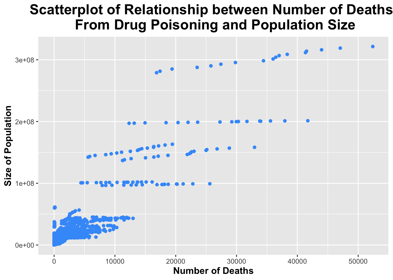
ggplot(processed_data, aes(x = Deaths, y = Population)) +geom_point(color ="#429bf9") +# giving the points of the scatterplot a blue colorlabs(title ="Scatterplot of Relationship between Number of Deaths \n From Drug Poisoning and Population Size",x ="Number of Deaths",y ="Size of Population") +# labeling axes and titles!theme(legend.position ="none", plot.title =element_text(size =18, face ="bold", hjust =0.5), axis.title.x =element_text(size =12, face ="bold"), axis.title.y =element_text(size =12, face ="bold")) # removing legend; making title and axes bold and giving them a larger font size
The scatterplot above, shows a positive linear relationship between the number of deaths from drug poisoning and the size of the population. The correlation coefficient is 0.8997261, which indicates a strong positive linear relationship.
Now, I will assess the relationship between year and death. Then, I will use the cor() function to obtain the correlation coefficient to determine the strength of this relationship.
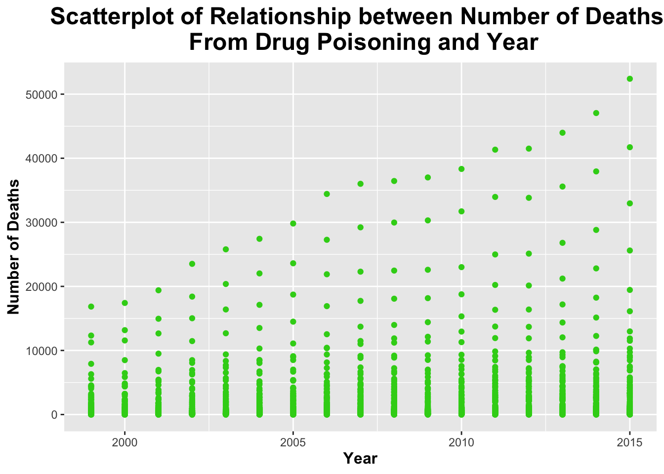
ggplot(processed_data, aes(x = Year, y = Deaths)) +geom_point(color ="#33d11a") +# giving the points of the scatterplot a green colorlabs(title ="Scatterplot of Relationship between Number of Deaths \n From Drug Poisoning and Year",x ="Year",y ="Number of Deaths") +# labeling axes and titles!theme(legend.position ="none", plot.title =element_text(size =18, face ="bold", hjust =0.5), axis.title.x =element_text(size =12, face ="bold"), axis.title.y =element_text(size =12, face ="bold")) # removing legend; making title and axes bold and giving them a larger font size
The scatterplot above shows that there may be a slight relationship between year and number deaths due to drug poisoning. The correlation coefficient is 0.1246065; this indicates a VERY weak relationship (possibly no realtionship at all).
I will create a correlation matrix. I did this in the “data-exercise” and found it to be helpful.
# use only numberic variables!cor_matrix <-cor(processed_data %>%select(where(is.numeric)))# print out!print(cor_matrix)
                       Year    Deaths Population Crude_Death_Rate
Year             1.00000000 0.1246065 0.01947317       0.32354160
Deaths           0.12460651 1.0000000 0.89972612       0.31923101
Population       0.01947317 0.8997261 1.00000000       0.06736837
Crude_Death_Rate 0.32354160 0.3192310 0.06736837       1.00000000
I will create a frequency table to display the total number of deaths from drug poisoning by year.
# Create frequency table for the total number of deaths by yeardeath_by_year <- processed_data %>%group_by(Year) %>%summarise(Total_Deaths =sum(Deaths, na.rm =TRUE)) %>%arrange(Year)# View the frequency tabledeath_by_year
I will assess the distribution of both the number of deaths due to drug poisoning and the population size.
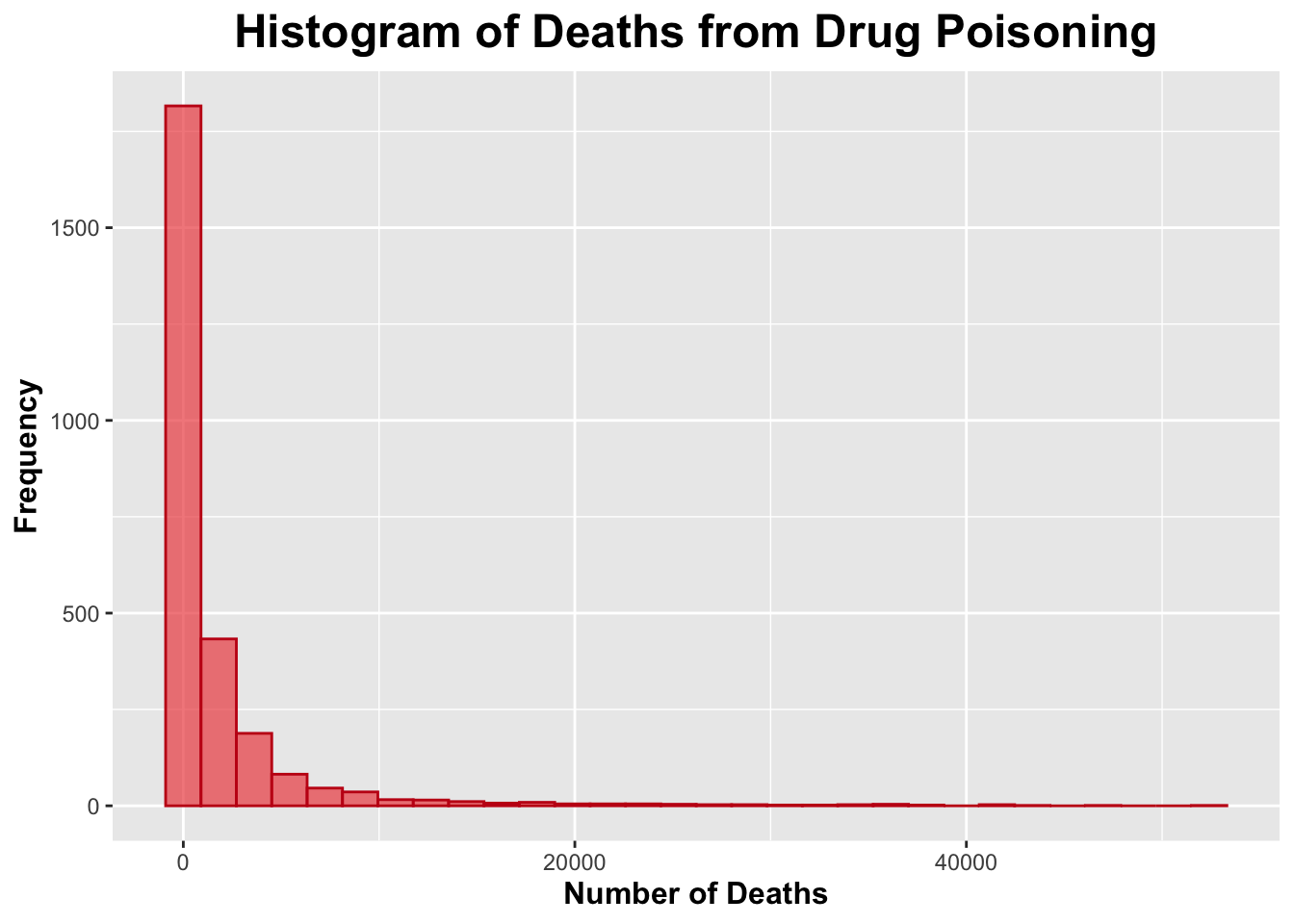
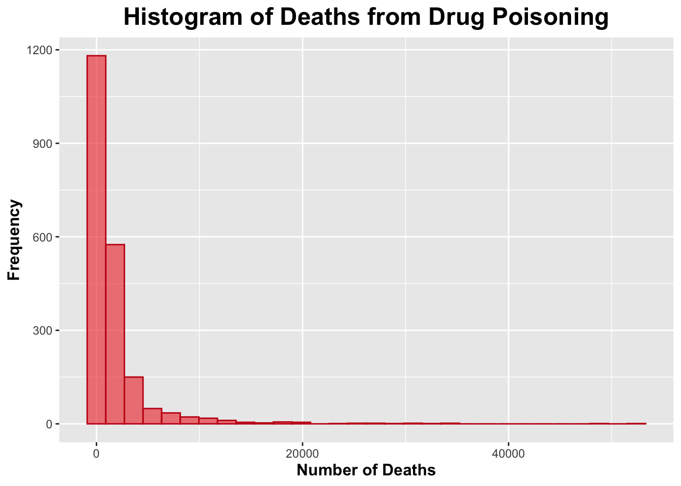
# Deathsggplot(processed_data, aes(x = Deaths)) +geom_histogram(bins =30, fill ="#ee5050", color ="#c41616", alpha =0.7) +labs(title ="Histogram of Deaths from Drug Poisoning",x ="Number of Deaths",y ="Frequency") +theme(plot.title =element_text(size =18, face ="bold", hjust =0.5),axis.title.x =element_text(size =12, face ="bold"),axis.title.y =element_text(size =12, face ="bold"))
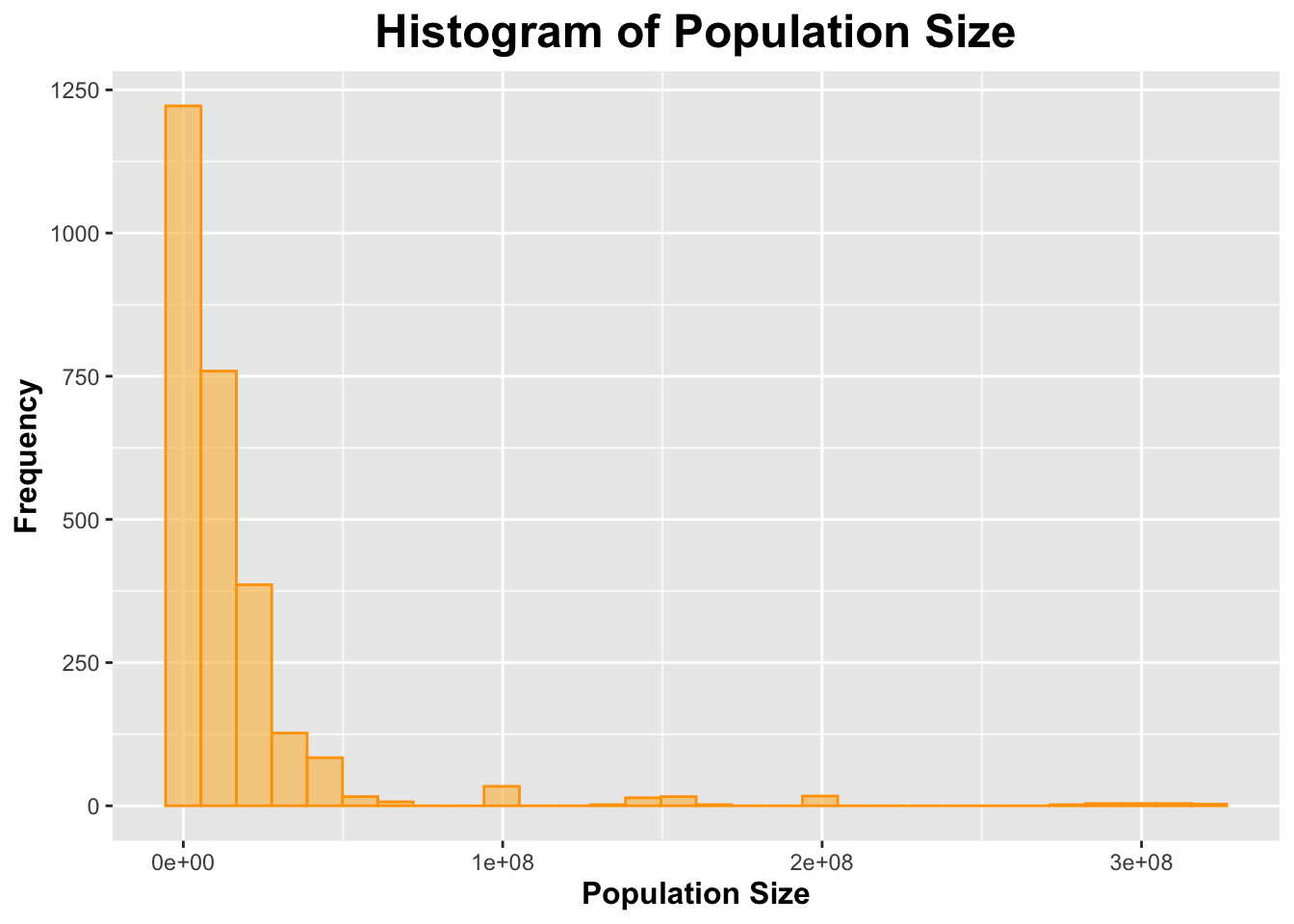
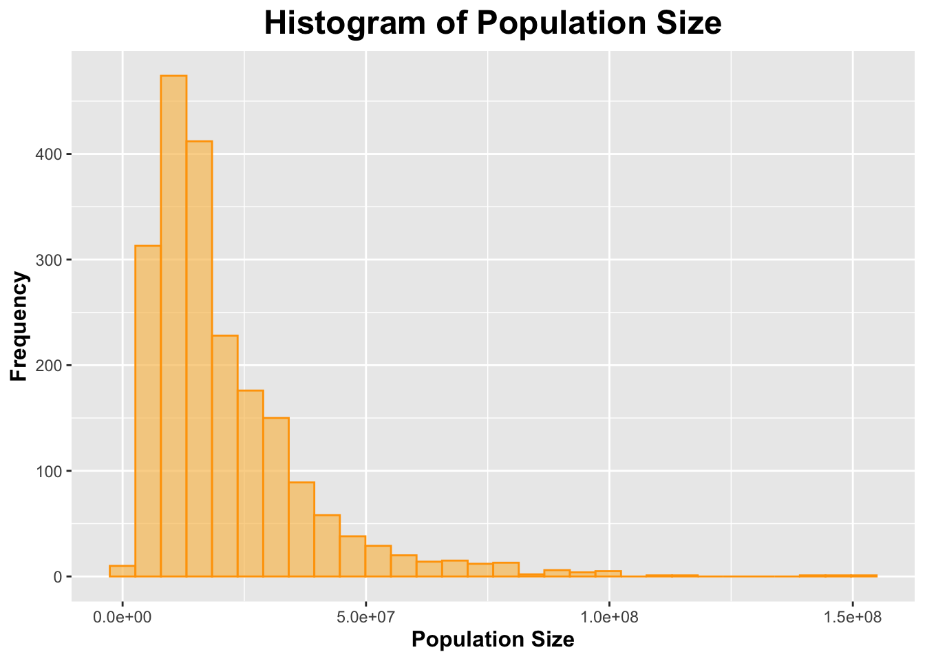
# Population Sizeggplot(processed_data, aes(x = Population)) +geom_histogram(bins =30, fill ="#f9c363", color ="#ffa303", alpha =0.7) +labs(title ="Histogram of Population Size",x ="Population Size",y ="Frequency") +theme(plot.title =element_text(size =18, face ="bold", hjust =0.5),axis.title.x =element_text(size =12, face ="bold"),axis.title.y =element_text(size =12, face ="bold"))
Both histograms for number of deaths due to drug poisoning and population size appeared to be skewed to the right.
I will create a table to display the mean and standard deviations of the number of deaths due to drug poisoning from 1999 to 2015 as well as the population size from 1999 to 2015.
# A tibble: 76 × 2
   `**Characteristic**`     `**N = 2,703**`
   <chr>                    <chr>
 1 Year                     2,007 2,007 1,999 2,015 5
 2 Sex                      <NA>
 3 Both Sexes               1,479 2,703 55%
 4 Female                   612 2,703 23%
 5 Male                     612 2,703 23%
 6 Age                      <NA>
 7 15-24 years              204 2,703 7.5%
 8 25-34 years              204 2,703 7.5%
 9 35-44 years              204 2,703 7.5%
10 45-54 years              204 2,703 7.5%
11 55-64 years              204 2,703 7.5%
12 65-74 years              204 2,703 7.5%
13 75+ years                204 2,703 7.5%
14 All Ages                 1,071 2,703 40%
15 Less than 15 years       204 2,703 7.5%
16 Race_and_Hispanic_Origin <NA>
17 All Races-All Origins    1,326 2,703 49%
18 Hispanic                 459 2,703 17%
19 Non-Hispanic Black       459 2,703 17%
20 Non-Hispanic White       459 2,703 17%
21 State                    <NA>
22 Alabama                  17 2,703 0.6%
23 Alaska                   17 2,703 0.6%
24 Arizona                  17 2,703 0.6%
25 Arkansas                 17 2,703 0.6%
26 California               17 2,703 0.6%
27 Colorado                 17 2,703 0.6%
28 Connecticut              17 2,703 0.6%
29 Delaware                 17 2,703 0.6%
30 District of Columbia     17 2,703 0.6%
31 Florida                  17 2,703 0.6%
32 Georgia                  17 2,703 0.6%
33 Hawaii                   17 2,703 0.6%
34 Idaho                    17 2,703 0.6%
35 Illinois                 17 2,703 0.6%
36 Indiana                  17 2,703 0.6%
37 Iowa                     17 2,703 0.6%
38 Kansas                   17 2,703 0.6%
39 Kentucky                 17 2,703 0.6%
40 Louisiana                17 2,703 0.6%
41 Maine                    17 2,703 0.6%
42 Maryland                 17 2,703 0.6%
43 Massachusetts            17 2,703 0.6%
44 Michigan                 17 2,703 0.6%
45 Minnesota                17 2,703 0.6%
46 Mississippi              17 2,703 0.6%
47 Missouri                 17 2,703 0.6%
48 Montana                  17 2,703 0.6%
49 Nebraska                 17 2,703 0.6%
50 Nevada                   17 2,703 0.6%
51 New Hampshire            17 2,703 0.6%
52 New Jersey               17 2,703 0.6%
53 New Mexico               17 2,703 0.6%
54 New York                 17 2,703 0.6%
55 North Carolina           17 2,703 0.6%
56 North Dakota             17 2,703 0.6%
57 Ohio                     17 2,703 0.6%
58 Oklahoma                 17 2,703 0.6%
59 Oregon                   17 2,703 0.6%
60 Pennsylvania             17 2,703 0.6%
61 Rhode Island             17 2,703 0.6%
62 South Carolina           17 2,703 0.6%
63 South Dakota             17 2,703 0.6%
64 Tennessee                17 2,703 0.6%
65 Texas                    17 2,703 0.6%
66 United States            1,836 2,703 68%
67 Utah                     17 2,703 0.6%
68 Vermont                  17 2,703 0.6%
69 Virginia                 17 2,703 0.6%
70 Washington               17 2,703 0.6%
71 West Virginia            17 2,703 0.6%
72 Wisconsin                17 2,703 0.6%
73 Wyoming                  17 2,703 0.6%
74 Deaths                   1,873 478 1 52,404 4,525
75 Population               16,586,603 6,403,290 238,163 321,418,820 34,492,886
76 Crude_Death_Rate         10 9 0 54 8
Generate the synthetic data
I would like to generate the synthetic data according to the composition of categorical variable and the distribution of continuous variable. I tried to use ChatGPT to generate the data for me, and here is my initial prompt: “Generate synthetic data: there are 8 variables and 2073 observations. For the continuous variable Year, it is from 1,999 to 2015, mean 2,007, median 2,007. For Sex, Age, Race_and_Hispanic_Origin, and State, refer to the gtsummary tibble. For Population, it is from 238,163 to 321,418,820, mean 16,586,603, median 6,403,290, sd 34,492,886, the distribution is skewed to the right. For Deaths, it is from 1 to 52,404, mean 1,873, median 478, sd 4,525, the distribution is skewed to the right. Crude_Death_Rate is from Deaths divided by Population. There is a positive linear relationship between Deaths and Population. The correlation coefficient is 0.8997. Give me the code to generate such data.” Then I manually add the specific content in the code to generate categorical data. At first, I tired to add correlation between Deaths and Population, but I found things get more and more complicated and could not work. I suspect that the correlation in the original data was due to some outliers, so I eventually generate the deaths data without considering the correlation.
set.seed(123) # Set seed for reproducibility# Number of observationsn <-2073# 1. Generate 'Year' (Continuous Variable)year_min <-1999year_max <-2015year_mean <-2007year_median <-2007# Generating Year as uniformly distributed between min and maxyear <-sample(year_min:year_max, n, replace =TRUE)# 2. Generate 'Sex' (Categorical Variable)sex_levels <-c("Both Sexes", "Female", "Male")sex_probs <-c(0.55, 0.225, 0.225) sex <-sample(sex_levels, n, replace =TRUE, prob = sex_probs)# 3. Generate 'Age' (Categorical Variable)age_levels <-c("15-24 years", "25-34 years", "35-44 years", "45-54 years", "55-64 years", "65-74 years", "75+ years", "All Ages", "Less than 15 years")age_probs <-c(0.075, 0.075, 0.075, 0.075, 0.075, 0.075, 0.075, 0.4, 0.075) age <-sample(age_levels, n, replace =TRUE, prob = age_probs)# 4. Generate 'Race_and_Hispanic_Origin' (Categorical Variable)race_levels <-c("All Races-All Origins", "Hispanic", "Non-Hispanic Black", "Non-Hispanic White")race_probs <-c(0.49, 0.17, 0.17, 0.17) race_and_hispanic_origin <-sample(race_levels, n, replace =TRUE, prob = race_probs)# 5. Generate 'State' (Categorical Variable)state_levels <-c("Alabama", "Alaska", "Arizona", "Arkansas", "California", "Colorado", "Connecticut", "Delaware", "District of Columbia", "Florida", "Georgia", "Hawaii", "Idaho", "Illinois", "Indiana", "Iowa", "Kansas", "Kentucky", "Louisiana", "Maine", "Maryland", "Massachusetts", "Michigan", "Minnesota", "Mississippi", "Missouri", "Montana", "Nebraska", "Nevada", "New Hampshire", "New Jersey", "New Mexico", "New York", "North Carolina", "North Dakota", "Ohio", "Oklahoma", "Oregon", "Pennsylvania", "Rhode Island", "South Carolina", "South Dakota", "Tennessee", "Texas", "United States", "Utah", "Vermont", "Virginia", "Washington", "West Virginia", "Wisconsin", "Wyoming") state_probs <-c(0.0063, 0.0063, 0.0063, 0.0063, 0.0063, 0.0063, 0.0063, 0.0063, 0.0063, 0.0063, 0.0063, 0.0063, 0.0063, 0.0063, 0.0063, 0.0063, 0.0063, 0.0063, 0.0063, 0.0063, 0.0063, 0.0063, 0.0063, 0.0063, 0.0063, 0.0063, 0.0063, 0.0063, 0.0063, 0.0063, 0.0063, 0.0063, 0.0063, 0.0063, 0.0063, 0.0063, 0.0063, 0.0063, 0.0063, 0.0063, 0.0063, 0.0063, 0.0063, 0.0063, 0.6787, 0.0063, 0.0063, 0.0063, 0.0063, 0.0063,0.0063, 0.0063) state <-sample(state_levels, n, replace =TRUE, prob = state_probs)# 6. Generate 'Population' (Continuous Variable) - skewed to the rightpopulation_min <-238163population_max <-321418820population_mean <-16586603population_median <-6403290population_sd <-34492886# Generate skewed population data using a log-normal distributionpopulation <-rlnorm(n, meanlog =log(population_mean), sdlog =log(population_sd / population_mean))# Ensure values are within rangepopulation <-pmin(pmax(population, population_min), population_max)# 7. Generate 'Deaths' (Continuous Variable) - skewed to the rightdeaths_min <-1deaths_max <-52404deaths_mean <-1873deaths_median <-478deaths_sd <-4525# Compute meanlog correctlymeanlog <-log(deaths_mean) -0.5*log(1+ (deaths_sd / deaths_mean)^2)sdlog <-sqrt(log(1+ (deaths_sd / deaths_mean)^2))# Generate right-skewed death countsdeaths <-rlnorm(n, meanlog = meanlog, sdlog = sdlog)# Ensure values are within rangedeaths <-pmin(pmax(deaths, deaths_min), deaths_max)# 8. Generate 'Crude_Death_Rate' (Calculated as Deaths / Population)crude_death_rate <- deaths / population *1000# Crude Death Rate per 1000 people# Combine all the variables into a data framesynthetic_data <-data.frame(year = year,sex = sex,age = age,race_and_hispanic_origin = race_and_hispanic_origin,state = state,population = population,deaths = deaths,crude_death_rate = crude_death_rate)
Explore the synthetic data
# Get an overview of the datasummary(synthetic_data)
      year          sex                age            race_and_hispanic_origin
 Min.   :1999   Length:2073        Length:2073        Length:2073
 1st Qu.:2003   Class :character   Class :character   Class :character
 Median :2007   Mode  :character   Mode  :character   Mode  :character
 Mean   :2007
 3rd Qu.:2011
 Max.   :2015
    state             population            deaths         crude_death_rate
 Length:2073        Min.   :  1170322   Min.   :    2.59   Min.   :0.00009
 Class :character   1st Qu.:  9855446   1st Qu.:  261.33   1st Qu.:0.01399
 Mode  :character   Median : 15827533   Median :  704.64   Median :0.04387
                    Mean   : 20958124   Mean   : 1750.65   Mean   :0.13607
                    3rd Qu.: 27226765   3rd Qu.: 1694.76   3rd Qu.:0.12293
                    Max.   :153425514   Max.   :52404.00   Max.   :4.15957
dim(synthetic_data)
[1] 2073 8
head(synthetic_data)
  year        sex         age race_and_hispanic_origin         state population
1 2013       Male    All Ages       Non-Hispanic White       Vermont   18232163
2 2012 Both Sexes    All Ages    All Races-All Origins United States   16474079
3 2001 Both Sexes 25-34 years    All Races-All Origins  Pennsylvania   21448794
4 2008     Female 15-24 years    All Races-All Origins United States   31220194
5 2009       Male 35-44 years       Non-Hispanic Black United States   17713506
6 2003       Male    All Ages                 Hispanic United States    9014091
      deaths crude_death_rate
1 4294.85196      0.235564594
2   52.01475      0.003157369
3  204.27761      0.009523967
4  523.45079      0.016766417
5 1111.77805      0.062764425
6  455.80316      0.050565627
# Assess the distribution of deaths and population# Deathsggplot(synthetic_data, aes(x = deaths)) +geom_histogram(bins =30, fill ="#ee5050", color ="#c41616", alpha =0.7) +labs(title ="Histogram of Deaths from Drug Poisoning",x ="Number of Deaths",y ="Frequency") +theme(plot.title =element_text(size =18, face ="bold", hjust =0.5),axis.title.x =element_text(size =12, face ="bold"),axis.title.y =element_text(size =12, face ="bold"))
# Population Sizeggplot(synthetic_data, aes(x = population)) +geom_histogram(bins =30, fill ="#f9c363", color ="#ffa303", alpha =0.7) +labs(title ="Histogram of Population Size",x ="Population Size",y ="Frequency") +theme(plot.title =element_text(size =18, face ="bold", hjust =0.5),axis.title.x =element_text(size =12, face ="bold"),axis.title.y =element_text(size =12, face ="bold"))
# Create frequency table for the total number of deaths by yeardeath_by_year1 <- synthetic_data %>%group_by(year) %>%summarise(total_deaths =sum(deaths, na.rm =TRUE)) %>%arrange(year)# View the frequency tabledeath_by_year1
# Create table to display the mean and standard deviations of the number of deaths from 1999 to 2015 as well as populationfrom 1999 to 2015distribution_table1 <- synthetic_data %>%group_by(year) %>%summarise(mean_deaths =mean(deaths, na.rm =TRUE),sd_deaths =sd(deaths, na.rm =TRUE),mean_population =mean(population, na.rm =TRUE),sd_population =sd(population, na.rm =TRUE) )print(distribution_table1)
The overall distribution of variables in the synthetic data is very similar to the original data. The trends of total deaths and population by the year are also similar to the original ones, while the trend of mean deaths is not very similar to the original one. Generally speaking, the synthetic data is good while with some imperfection.