For full project, visit the repository: https://github.com/NatalieCann16/Cann-MADA-project/tree/main
Overview
Analysis of COVID-19 Vaccination Trends: Distribution and Administration
This document provides supplementary material for the manuscript “Analysis of COVID-19 Vaccination Trends: Distribution and Administration”. It includes additional details on the methods used in the analysis, as well as additional results that were not included in the main manuscript.
Reproducing Results
Reproducing this project requires R, RStudio, and Microsoft Word. Files should be run in the following order.
- In the code > processing-code folder: processing.qmd
- In the code > eda-code folder: exploratoryanalysis.qmd
- In the code > analysis-code folder: analysis.Rmd
- In the products > manuscript folder: manuscript.qmd
- In the products > manuscript > supplement folder: Supplementary-Material.qmd
Supplementary Results
Table one displays a summary of each variable of the COVID-19 vaccine dataset.
| Total Distributed (All) |
5.667000e+08 |
| Total Distributed – Janssen |
2.550002e+07 |
| Total Distributed – Moderna |
2.141924e+08 |
| Total Distributed – Pfizer |
3.186000e+08 |
| Total Distributed – Novavax |
2.410320e+05 |
| Total Distributed – Unknown |
7.701900e+04 |
| Total Administered (All) |
4.479000e+08 |
| Total Administered – Janssen |
1.504262e+07 |
| Total Administered – Moderna |
1.733713e+08 |
| Total Administered – Pfizer |
2.582345e+08 |
| Total Administered – Novavax |
1.365400e+04 |
| Total Administered – Unknown |
4.439420e+05 |
| Total Distributed per 100k |
4.996000e-01 |
| Distributed – Janssen per 100k |
3.090400e+04 |
| Distributed – Moderna per 100k |
2.594080e+05 |
| Distributed – Pfizer per 100k |
3.873940e+05 |
| Distributed – Novavax per 100k |
2.790220e+02 |
| Distributed – Unknown per 100k |
9.357000e+01 |
| Total Administered per 100k |
5.490530e+05 |
| Administered – Janssen per 100k |
1.856900e+04 |
| Administered – Moderna per 100k |
2.122234e+05 |
| Administered – Pfizer per 100k |
3.167740e+05 |
| Administered – Novavax per 100k |
1.617800e+01 |
| Administered – Unknown per 100k |
4.892019e+02 |
Supplement Table 1: Summary Statistics of the Vaccination Data in Original Dataset and Population Adjusted Dataset
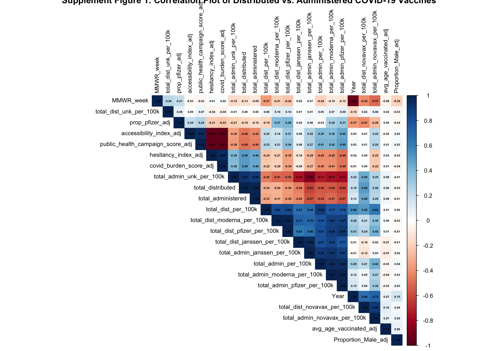
Figure one displays the correlations between all variables within the COVID-19 vaccine population adjusted dataset.
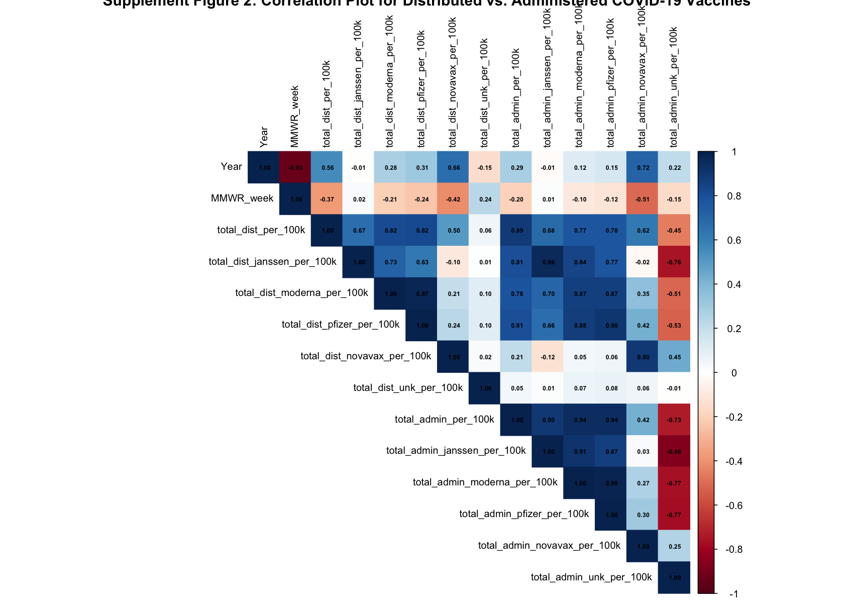
Figure two shows the correlations of specifically the distribution and administration variables in the dataset. The correlation between total_administered and total_distributed is 0.89; the correlation between total_admin_janssen and total_dist_janssen is 0.96; the correlation between total_admin_moderna and total_dist_moderna is 0.87; the correlation between total_admin_pfizer and total_dist_pfizer is 0.90; the correlation between total_admin_novavax and total_dist_novavax is 0.90, which is the lowest of all manufacturers; and the correlation between total_admin_unk and total_dist_unk is -0.01. The distributed and administered unknown variables are likely a part of this dataset due to poor data recording.
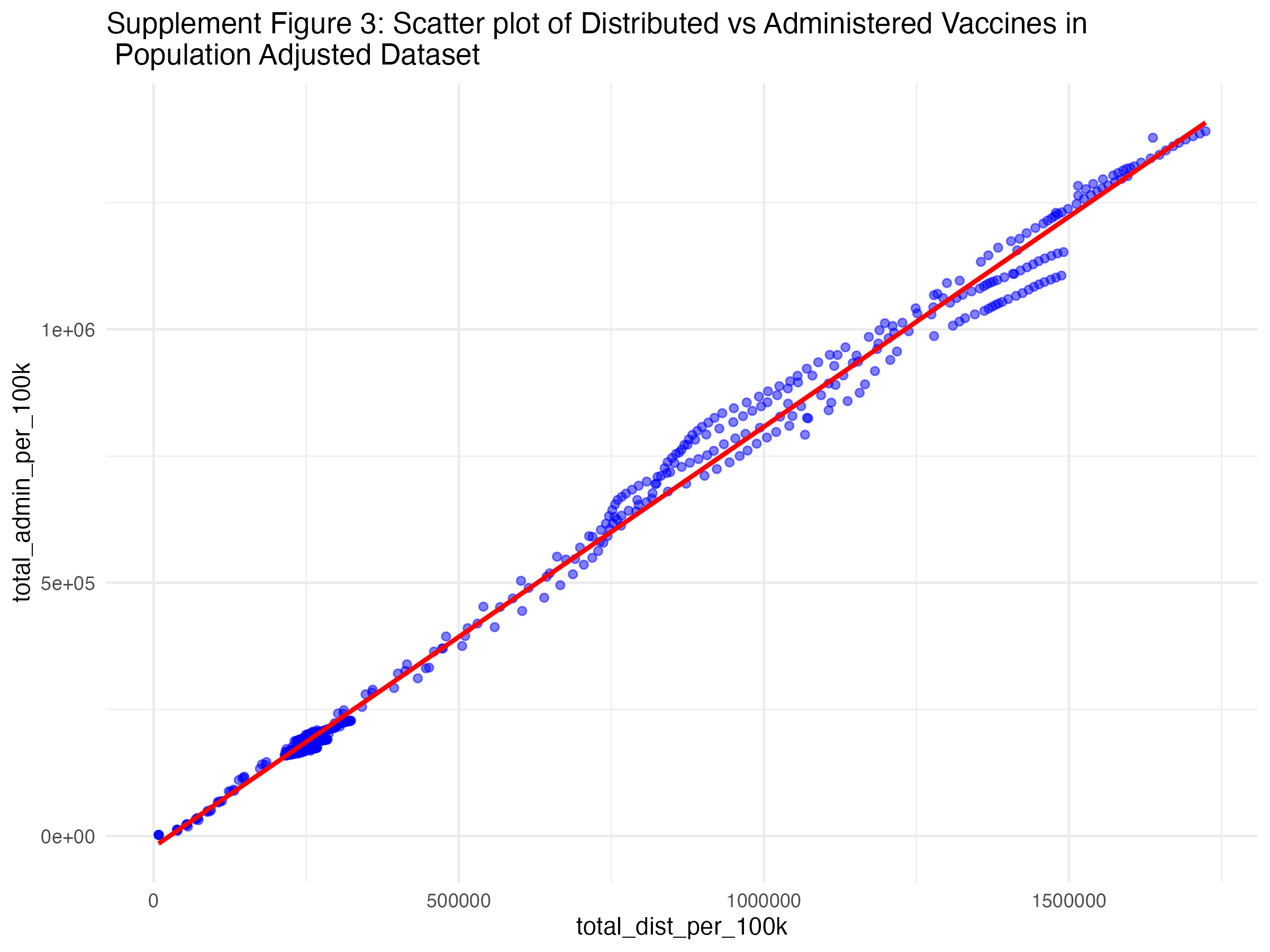
Below, you will several scatterplots. Figure three is an overall scatterplot of the relationship between administered and distributed doses. The points closely follow the diagonal line, indicating a strong relationship between the two variables (confirmed by the correlation coeffecient of 0.89).
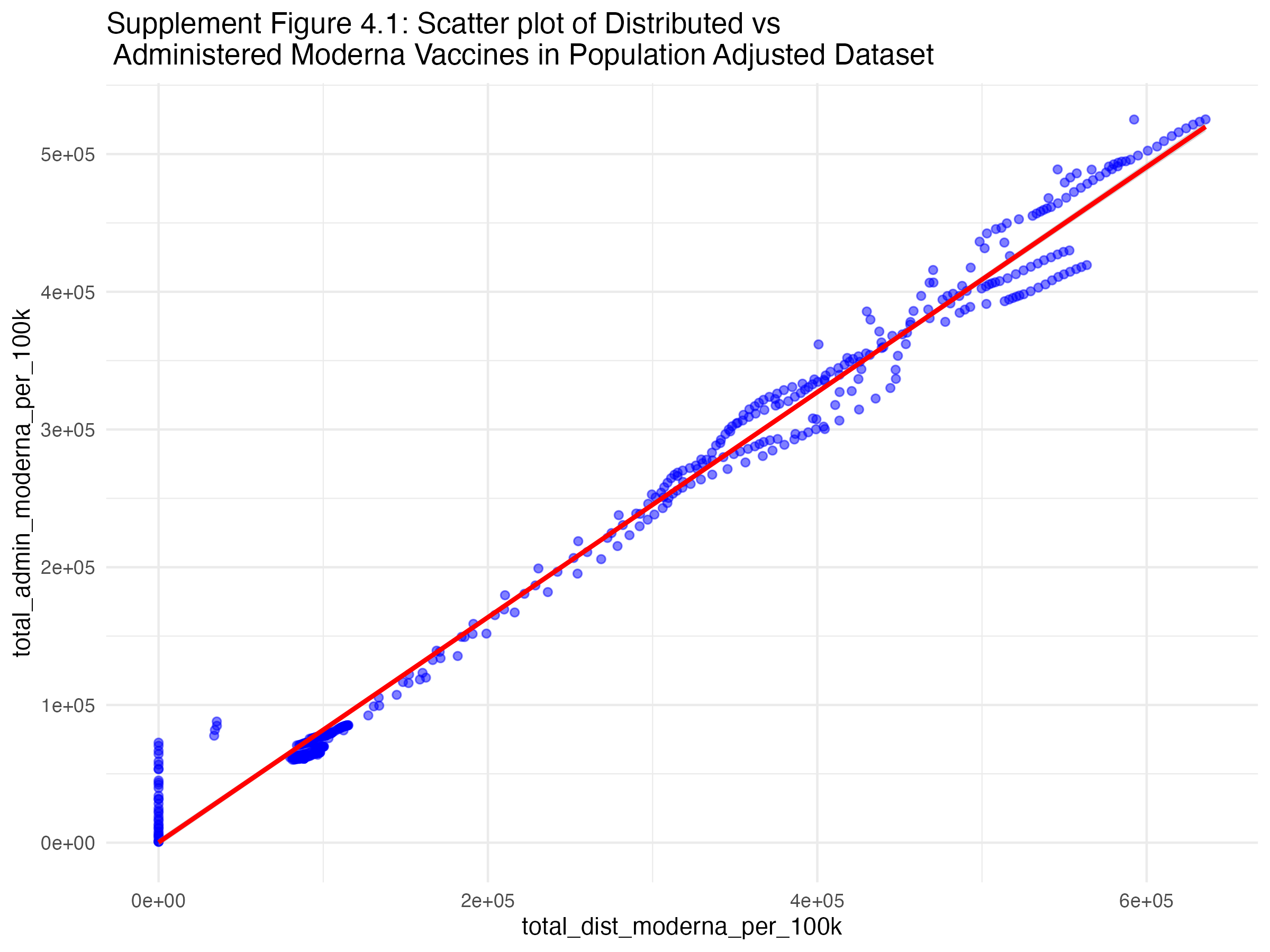
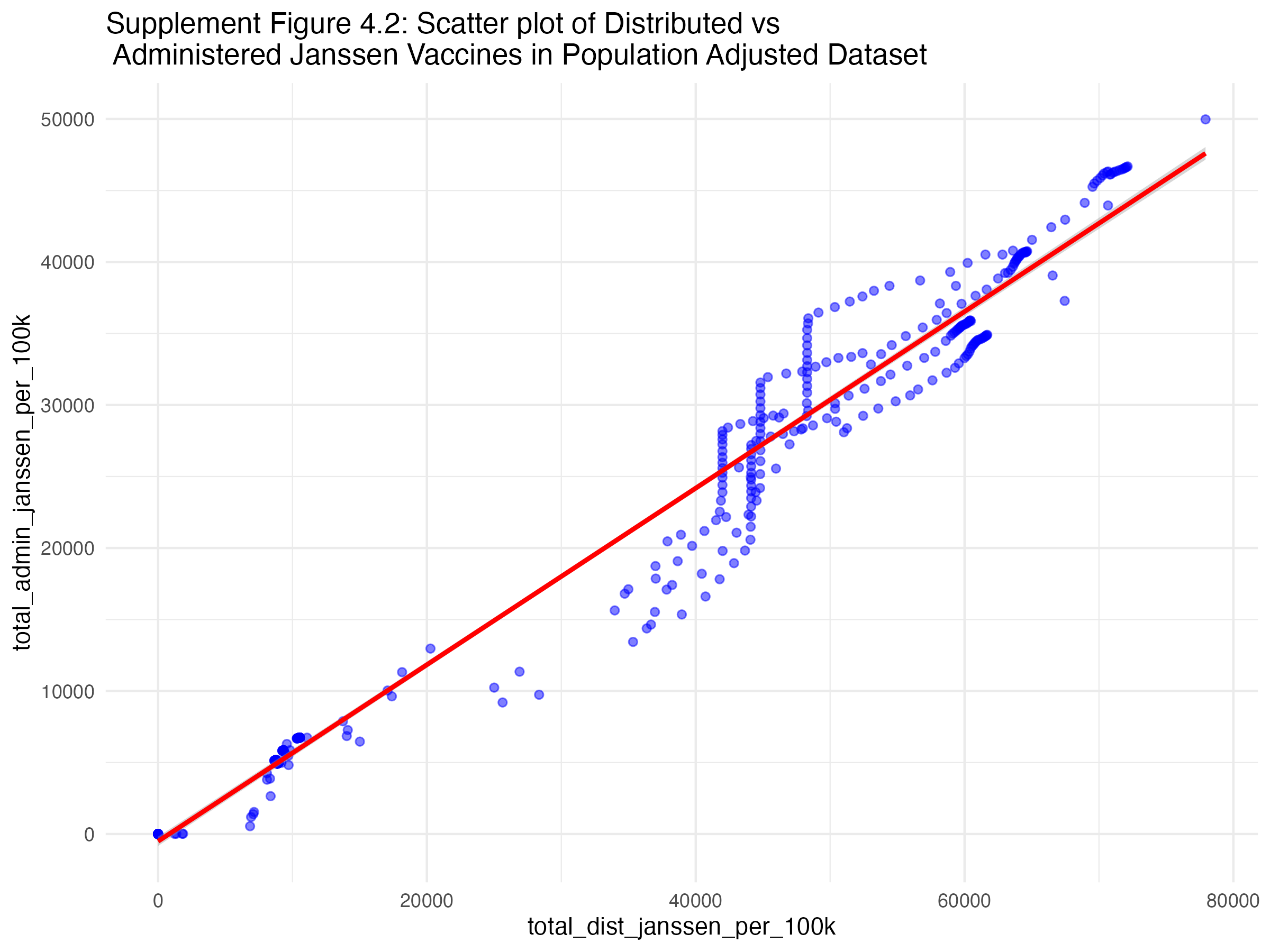
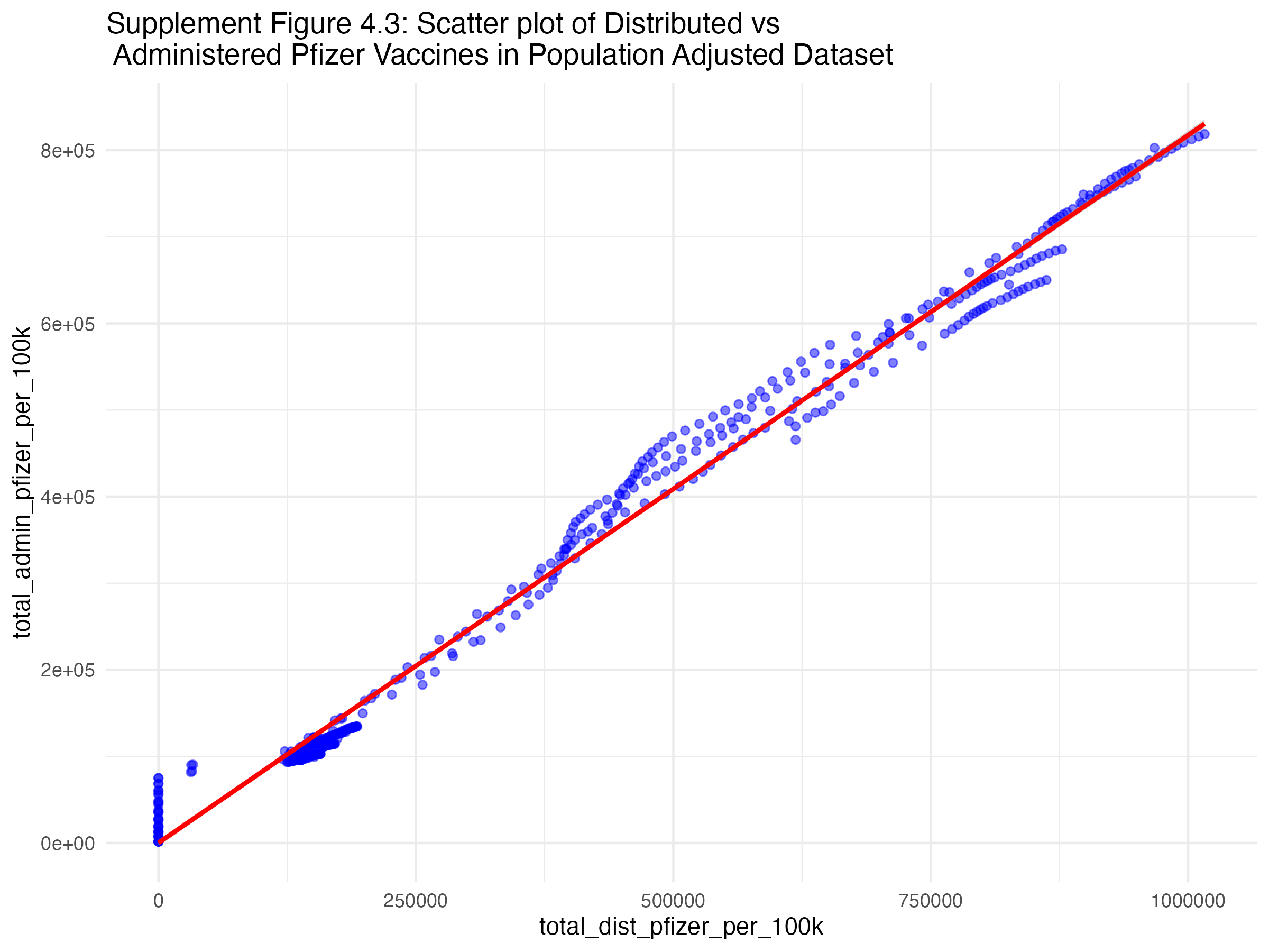
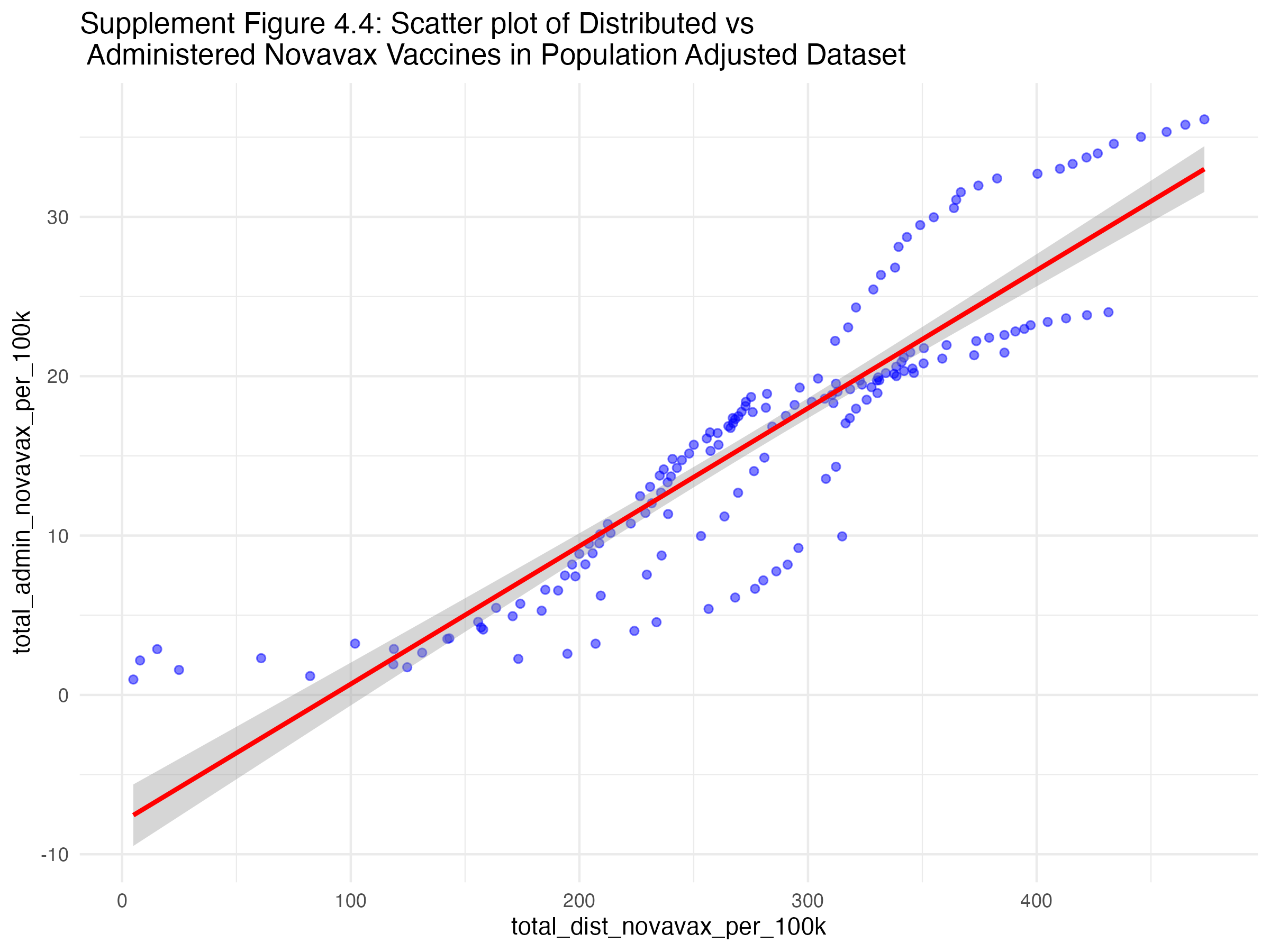
Figures 4.1, 4.2, 4.3, and 4.2 show the scatterplots of the relationship between administered and distributed doses for each vaccine manufacturer. It appears as though all regions have a strong positive correlation between the number of vaccines distributed and administered. However, Pfizer and Moderna’s points still follow the diagonal line the closest.
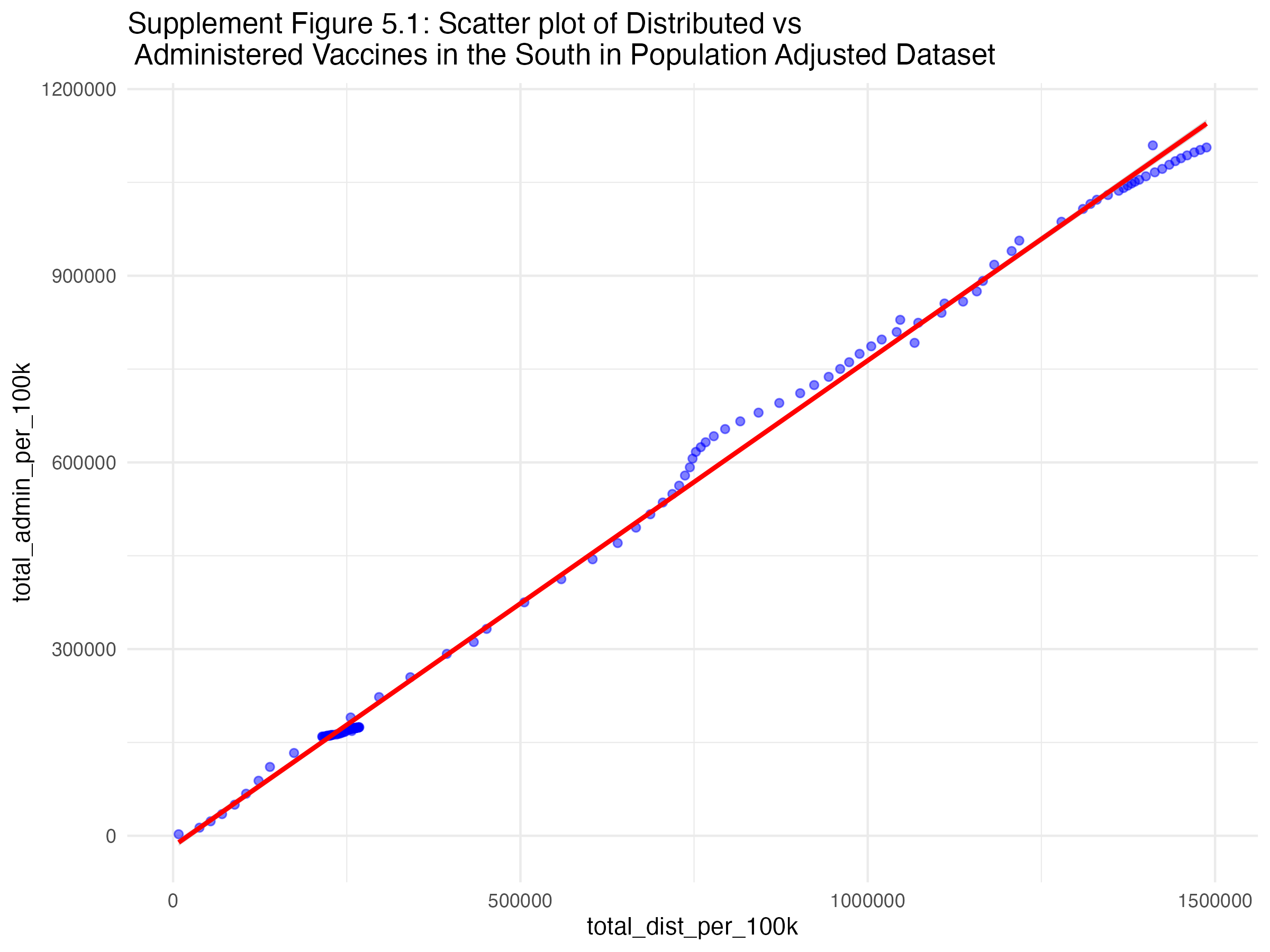
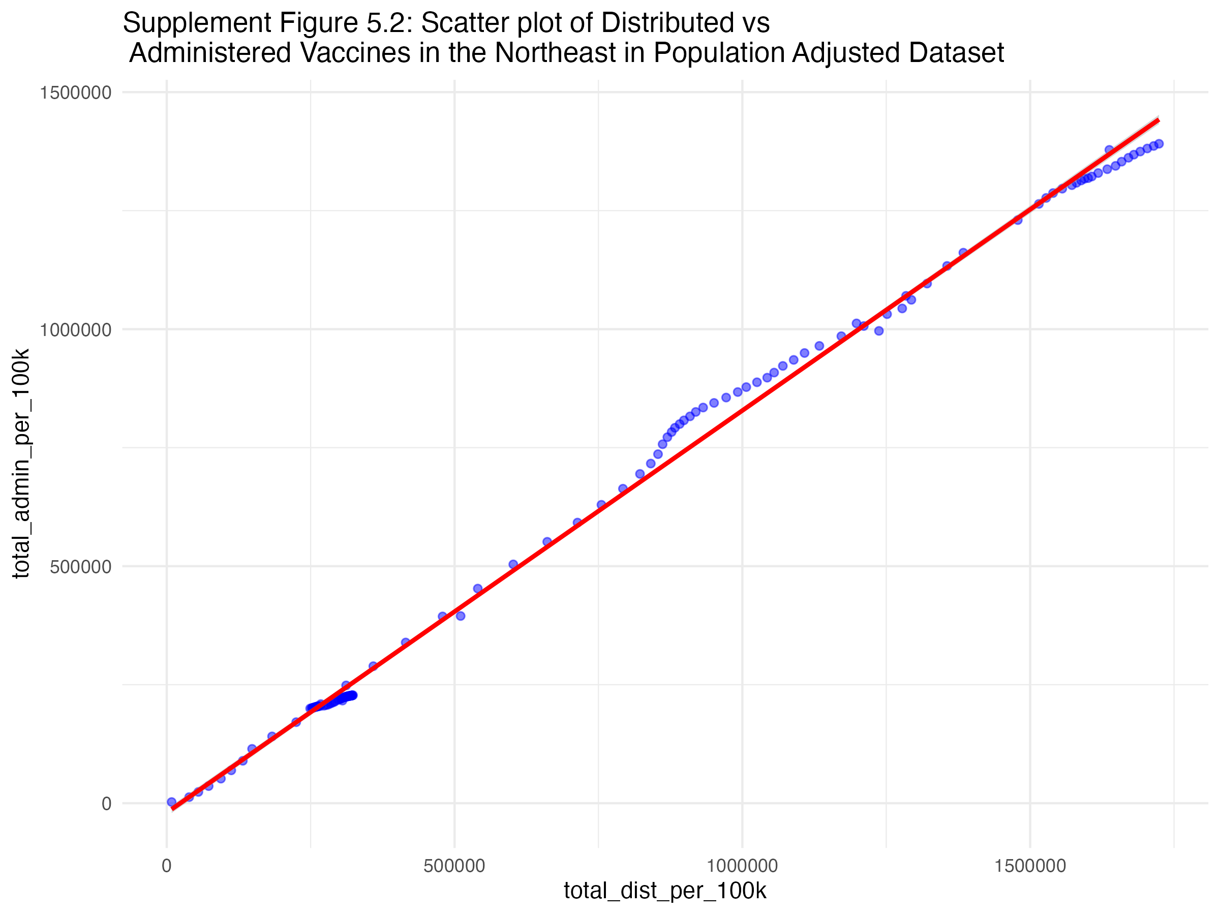
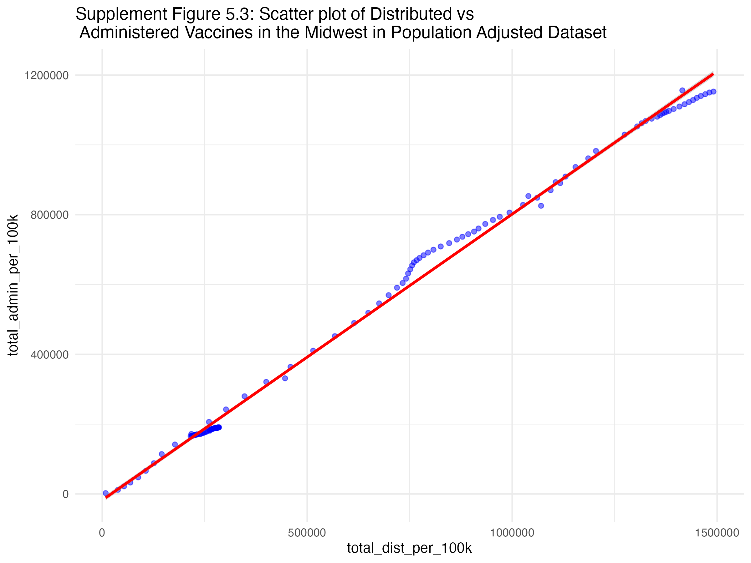
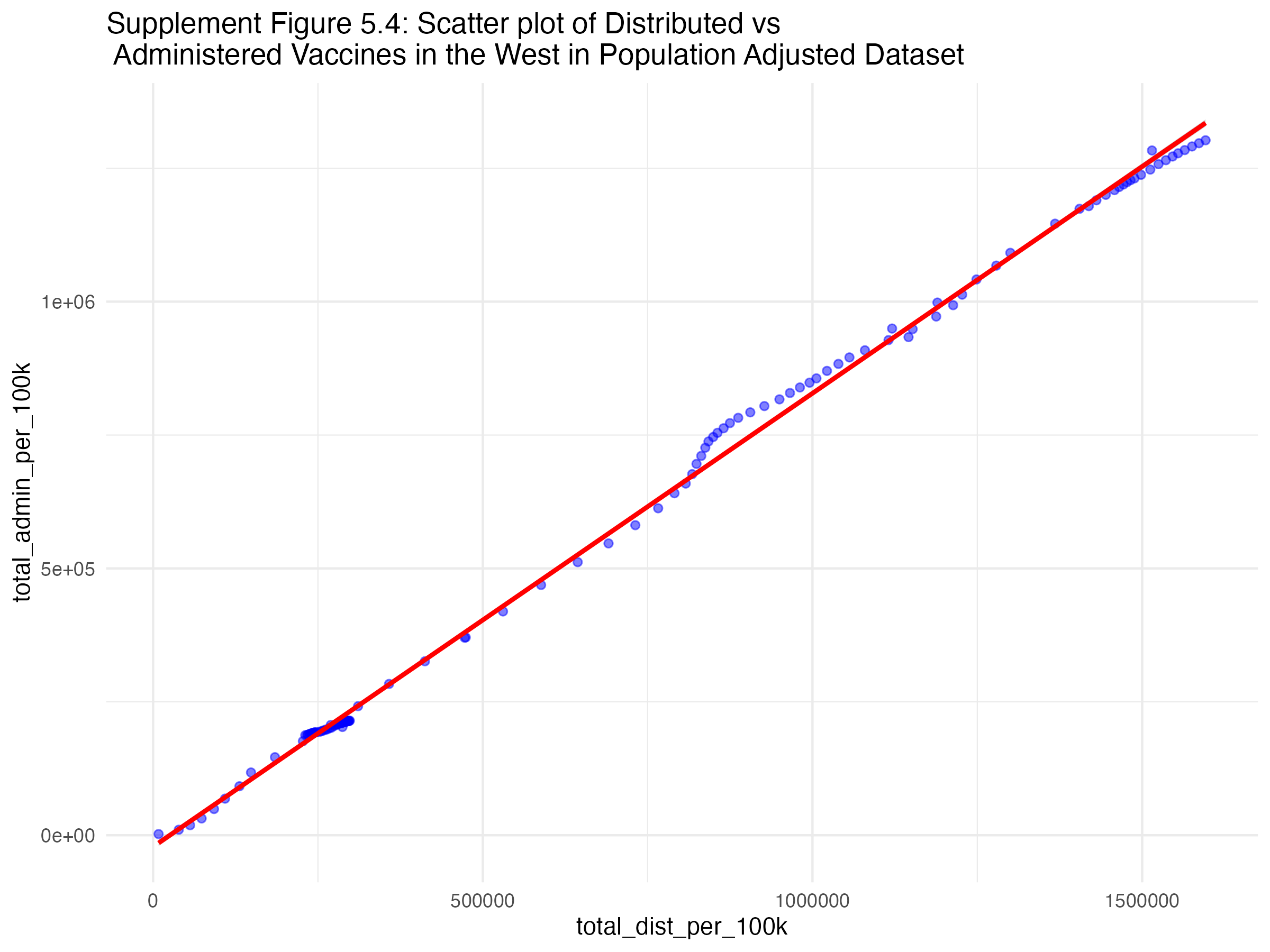
Figures 5.1, 5.2, 5.3, and 5.4 show the scatterplots of the relationship between administered and distributed doses for each region of the U.S..
Table two shows the correlations between doses administered and distributed in each region of the U.S.. All four regions have high correlations, however the west is the highest.
| Midwest |
0.9980132 |
| Northeast |
0.9983011 |
| South |
0.9987066 |
| West |
0.9990827 |
Supplement Table 2: Regional Correlations Between Doses Administered and Distributed in Pouplation Adjusted Dataset
Table three shows the percent rate change in distribution and administration of the COVID-19 vaccine across time in each region of the U.S.. The drops depicted in figures 3 and 4 in the manuscript can be seen in this table by the large percent drops in doses administered and distributed.
| 2021 |
Midwest |
35652869 |
29311185 |
NA |
NA |
| 2021 |
Northeast |
40435158 |
34364697 |
NA |
NA |
| 2021 |
South |
36233233 |
28111986 |
NA |
NA |
| 2021 |
West |
38700528 |
32296475 |
NA |
NA |
| 2022 |
Midwest |
39811314 |
31061255 |
11.663702 |
5.970653 |
| 2022 |
Northeast |
46080990 |
37372257 |
13.962682 |
8.751889 |
| 2022 |
South |
39742533 |
29711380 |
9.685308 |
5.689365 |
| 2022 |
West |
42680522 |
34861661 |
10.284083 |
7.942619 |
| 2023 |
Midwest |
5306961 |
3600733 |
-86.669716 |
-88.407638 |
| 2023 |
Northeast |
6028417 |
4298397 |
-86.917780 |
-88.498429 |
| 2023 |
South |
5005472 |
3294600 |
-87.405250 |
-88.911320 |
| 2023 |
West |
5557185 |
4045517 |
-86.979576 |
-88.395514 |
Supplement Table 3: Percent Rate Change in Distribution and Administration of COVID-19 Vaccine with time in each Region (in Population Adjusted Dataset)
Table 4.1 and 4.2 show the percent rate change in distribution (4.1) and administration (4.2) of the COVID-19 vaccine across time for each manufacturer. The drops depicted in figures 5 and 6 in the manuscript can be seen in this table by the large percent drops in doses administered and distributed.
| Janssen |
2021 |
7485221.42 |
- |
| Janssen |
2022 |
7131071.61 |
-4.73% |
| Janssen |
2023 |
712227.99 |
-90.01% |
| Moderna |
2021 |
59085477.92 |
- |
| Moderna |
2022 |
62011953.91 |
4.95% |
| Moderna |
2023 |
7569083.75 |
-87.79% |
| Novavax |
2021 |
0.00 |
- |
| Novavax |
2022 |
19611.74 |
Inf% |
| Novavax |
2023 |
26147.80 |
33.33% |
| Pfizer |
2021 |
80496466.34 |
- |
| Pfizer |
2022 |
99150229.37 |
23.17% |
| Pfizer |
2023 |
12500508.65 |
-87.39% |
Supplement Table 4.1: Percent Rate Change in Distribution of COVID-19 Vaccine with time for each Manufacturer (in Population Adjusted Dataset)
| Janssen |
2021 |
4.433968e+06 |
- |
| Janssen |
2022 |
4.345841e+06 |
-1.99% |
| Janssen |
2023 |
4.303261e+05 |
-90.1% |
| Moderna |
2021 |
4.966932e+07 |
- |
| Moderna |
2022 |
5.007688e+07 |
0.82% |
| Moderna |
2023 |
5.516585e+06 |
-88.98% |
| Novavax |
2021 |
0.000000e+00 |
- |
| Novavax |
2022 |
9.065808e+02 |
Inf% |
| Novavax |
2023 |
1.746609e+03 |
92.66% |
| Pfizer |
2021 |
6.986818e+07 |
- |
| Pfizer |
2022 |
7.846953e+07 |
12.31% |
| Pfizer |
2023 |
8.782378e+06 |
-88.81% |
Supplement Table 4.2: Percent Rate Change in Administration of COVID-19 Vaccine with time for each Manufacturer (in Population Adjusted Dataset)
Table 5 shows the RMSE value of the null model (with no predictors) from the modeling analysis. The R-squared can be assumed to be 0 here.
| rmse |
standard |
0.1547925 |
| mae |
standard |
0.0864073 |
| rsq |
standard |
NA |
Supplement Table 5: Null Model RMSE
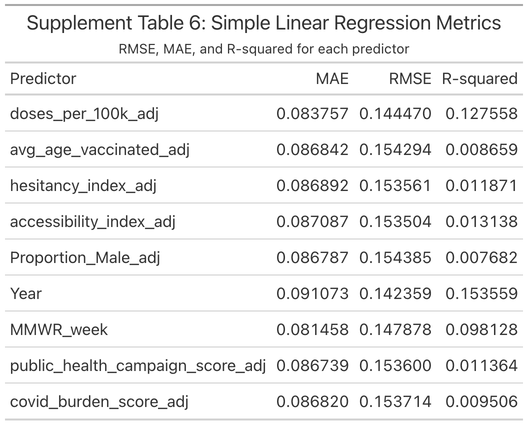
Table 6 shows the Simple Linear Regression Metrics results from the modeling analysis.
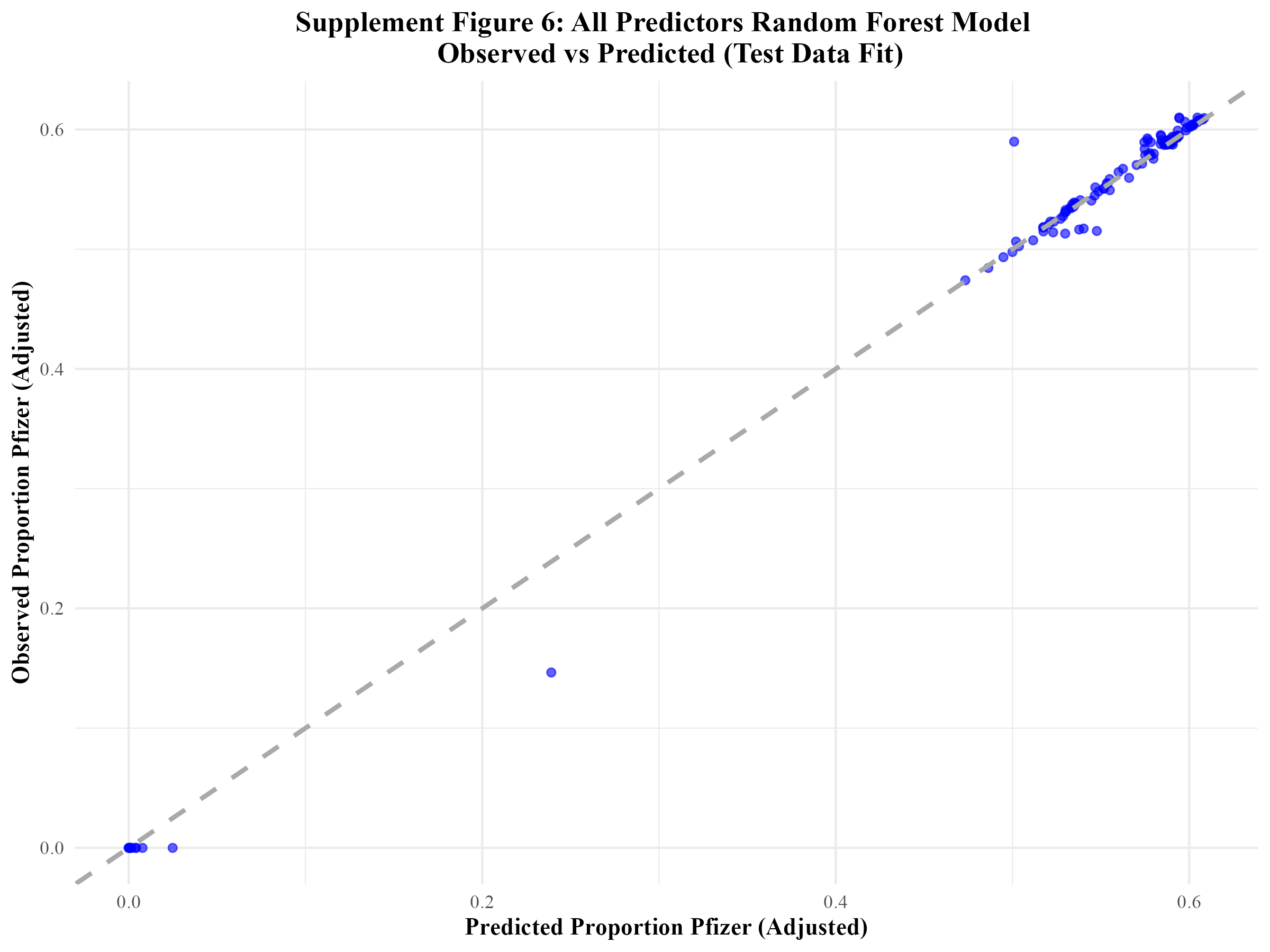
An additional model (the random forest model including all predictors) was fitted to the test data out of curiosity. The metrics are shown in Table 7.
| rmse |
standard |
0.0132909 |
| rsq |
standard |
0.9930341 |
| mae |
standard |
0.0052497 |
Supplement Table 7: Original/All Predictors Random Forest Model Test Data Metrics
Figure 6 displays the corresponding observed vs predicted plot for this model when it was fitted to the test data.